

What is Mobile-First?
Definition
Mobile-first has two related meanings. As a design approach, it means designing and coding for the smallest screens first and then enhancing the layout for larger ones. In search, mobile-first indexing means Google crawls pages with its smartphone crawler and uses the mobile version of a site's content for indexing and ranking.
Also known as: mobile-first design, mobile-first indexing, mobile first
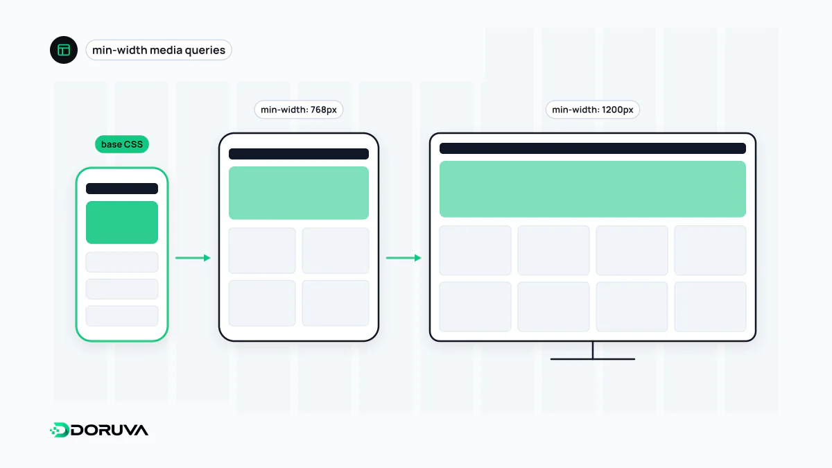
Mobile-first as a design approach
Starting with the small screen is an exercise in priorities. A phone has room for only a few blocks at a time, so you have to decide early which one comes first and which menu items truly earn their place. Wider screens then add columns, sidebars and extra detail on top of that lean base. This progressive enhancement usually produces cleaner results than squeezing a finished desktop page onto a phone.
In CSS, the difference shows in the direction of the media queries:
/* Mobile-first: base styles for small screens, added to as width grows */
.menu { display: block; }
@media (min-width: 48em) {
  .menu { display: flex; gap: 2rem; }
}

/* Desktop-first: base styles for wide screens, undone as width shrinks */
.menu { display: flex; gap: 2rem; }
@media (max-width: 47.99em) {
  .menu { display: block; gap: 0; }
}
With the first pattern, phones don't spend effort overriding rules they never needed, and the stylesheet is easier to follow. Mobile-first doesn't compete with responsive design; it is usually the preferred way to build it.
Mobile-first indexing at Google
Google uses the mobile version of a site's content, crawled with its smartphone agent, for indexing and ranking. The shift began in 2016, and Google announced in October 2023 that it was complete. A final announcement in June 2024 said the small set of sites still crawled by desktop Googlebot would be crawled only with Googlebot Smartphone after 5 July 2024, and that sites whose content isn't accessible at all on a mobile device would no longer be indexable. Googlebot Desktop can still appear in your logs: Google notes it is sometimes used for a few features such as product listings and Google for Jobs.
In short, the mobile version is now the site as far as Google is concerned. Crawling and indexing are based on what the mobile page contains.
Content parity checklist
- Primary content (text, images, video) should be the same on mobile; paragraphs cut from the mobile page simply don't exist for Google.
- Headings, the title and the meta description should carry the same meaning on both versions.
- Structured data must be present on the mobile version too, with URLs that point to the mobile addresses.
- Robots meta tags should match; a stray
noindexon mobile can drop a page from the index. - Don't make primary content depend on swiping, clicking or typing to load; Google won't perform those interactions. Viewport-based lazy loading, implemented correctly, is fine.
- Don't block CSS, JavaScript or image files in robots.txt; Google needs them to render the page.
Common misconceptions
"There's a separate mobile index." There isn't. There is one index, built from the mobile version, and desktop searchers get results from it too.
"Mobile-first indexing is a ranking boost for mobile-friendly sites." It decides which version of a page gets indexed; it is not a reward in itself. Content missing from the mobile version, however, can't help the page rank for queries about that content.
"A responsive site has nothing to worry about." Responsive layouts give you parity almost for free, but content hidden on small screens, content that loads only after a tap, or resources blocked for mobile can still cause gaps.
The authoritative references are Google Search Central's mobile-first indexing best practices and the June 2024 announcement of the final step.