

What is Responsive Design?
Definition
Responsive design is an approach to building web pages whose layout, images and typography adapt automatically to the width of the screen. A single HTML document served at a single URL uses fluid grids, flexible media and CSS media queries, so the same page stays readable and usable on phones, tablets and desktops.
Also known as: responsive web design, RWD, mobile-friendly design
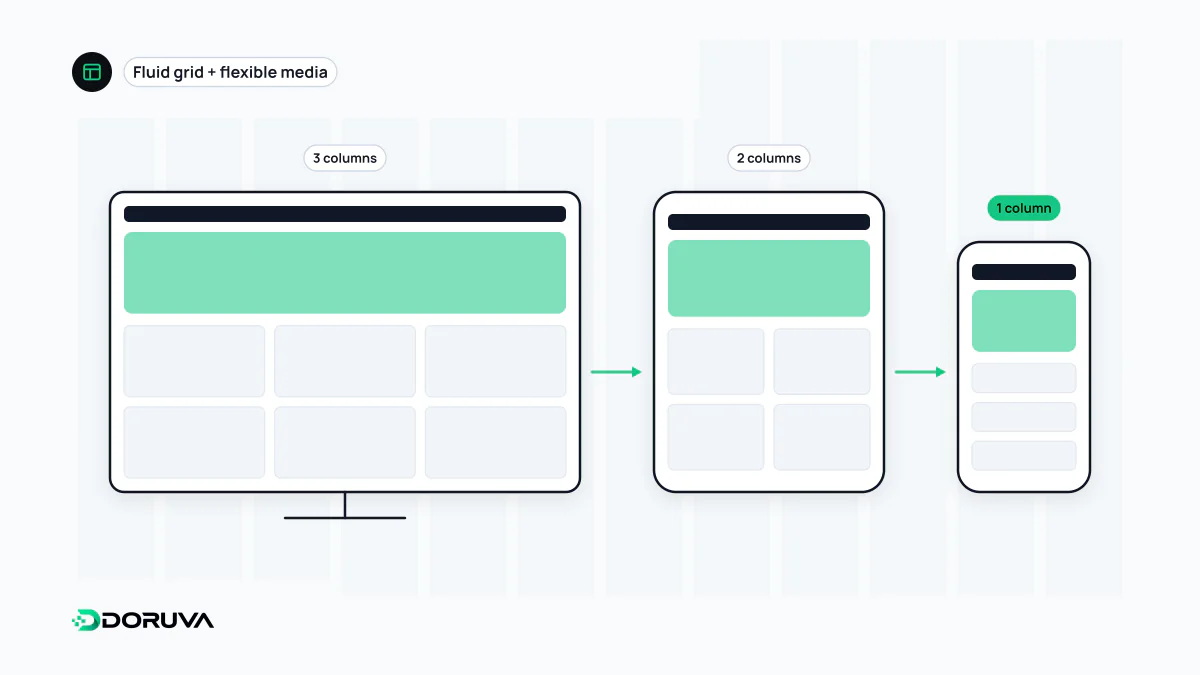
The three building blocks
Ethan Marcotte popularised the term in a 2010 A List Apart article. Instead of building a separate site for every class of device, one page adapts to whatever screen it lands on. Three techniques make that work together:
- Fluid grids: column widths are set in relative units such as percentages,
frorremrather than fixed pixels, today usually with CSS Grid and Flexbox. - Flexible media: images and video never overflow their container (
max-width: 100%), andsrcsetwithsizeslets the browser pick a file that fits the screen. - Media queries: CSS rules that apply only under certain conditions, most often when the viewport passes a given width.
None of this works without the viewport meta tag in the <head>. Without it, mobile browsers render the page at a desktop width, shrink it down, and your media queries never fire the way you intended.
<meta name="viewport" content="width=device-width, initial-scale=1">Breakpoints and media queries in practice
A breakpoint is the width at which the layout changes. In this example, cards sit in one column on phones, two on medium screens and three on wide ones:
/* Base styles: one column, for every screen */
.cards { display: grid; gap: 1rem; grid-template-columns: 1fr; }
img { max-width: 100%; height: auto; }

/* From 40em (about 640px) up: two columns */
@media (min-width: 40em) {
  .cards { grid-template-columns: repeat(2, 1fr); }
}

/* From 64em (about 1024px) up: three columns */
@media (min-width: 64em) {
  .cards { grid-template-columns: repeat(3, 1fr); }
}
The styles build upward from the smallest screen using min-width, which is how the mobile-first approach looks in CSS. Current browsers also accept the range syntax @media (width >= 40em) for the same condition. Some layouts need no media query at all: grid-template-columns: repeat(auto-fit, minmax(16rem, 1fr)) picks the column count from the available space. When a component should respond to the space it sits in rather than to the whole screen, a container query (@container) is the better tool.
Choose breakpoints where your content breaks, not from a list of popular devices. Narrow the window slowly; the point where lines get too long or elements start to crowd each other is your natural breakpoint.
Responsive, adaptive or a separate mobile site
| Approach | URLs | HTML | How it adapts |
|---|---|---|---|
| Responsive | One | One | CSS changes the layout by screen width |
| Dynamic serving (adaptive) | One | Varies by device | The server sends different HTML based on the user agent |
| Separate mobile URLs | Different (e.g. m.example.com) | Different | Mobile visitors are sent to another address |
Google supports all three configurations but recommends responsive design because it is the easiest to implement and maintain. A single URL also avoids splitting links and signals between two versions of the same page.
Where responsive builds go wrong
- Fixed pixel widths that cause a horizontal scrollbar on phones.
- Hiding important content on mobile with
display: none. Because Google evaluates the mobile version, that content effectively disappears for searchers as well as visitors. - Images without
widthandheightattributes, which push content down as they load and hurt CLS. - Sending desktop-sized images to phones. Correct sizing, efficient formats such as WebP and lazy loading for offscreen images make a visible difference on mobile.
- Blocking zoom with
user-scalable=no, which stops people from enlarging small text. - Tap targets such as buttons and menu links that are too small or too close together to hit with a finger.
How to test it
Device mode in browser developer tools is a good start, but don't stop at the preset sizes: drag the window from roughly 320px up to a wide desktop and watch every step, then try the page on a real phone for touch and keyboard behaviour. The SEO Checker flags a missing or fixed-width viewport tag. For the fundamentals in more depth, see web.dev's Responsive web design basics; for query syntax, the MDN guide to media queries.