

What is WebP?
Definition
WebP is an image format for the web developed by Google and announced in 2010. It supports lossy and lossless compression, transparency (alpha channel) and animation in a single format. At comparable visual quality it usually produces smaller files than JPEG and PNG, which helps pages load with less data and more quickly. All modern browsers support WebP today.
Also known as: WebP format, .webp, image/webp
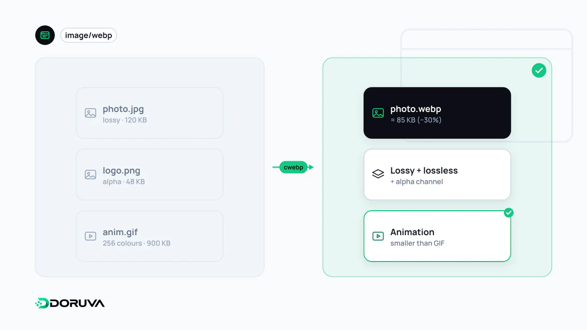
What the format offers
Lossy WebP is based on the intra-frame (single-frame) compression of the VP8 video codec, while lossless WebP uses a separately developed algorithm. That lets one format cover JPEG-style photo compression, PNG-style transparency and GIF-style animation.
Google's own measurements put lossless WebP files about 26% smaller than PNGs, and lossy WebP files 25–34% smaller than comparable JPEGs at an equivalent SSIM quality index. Those numbers come from a test set; real savings depend on the image content and encoder settings, so test with your own images. One limit worth knowing: each side of a WebP image can be at most 16,383 pixels. That rarely matters on the web, but rules it out for very large panoramas or print files.
Browser support
Chrome, Edge, Firefox and Opera have supported WebP for years, and since Safari added support with version 14 in 2020, WebP support across modern browsers is universal. Fallbacks today are mostly for very old devices, some email clients, or cases where the image is processed outside the browser.
WebP or AVIF?
AVIF is a newer format based on the AV1 video codec and often produces even smaller files than WebP at the same quality for photographs. The trade-offs: encoding is noticeably slower, and at low quality settings it tends to smooth away fine detail. AVIF is now supported by all major browsers as well, though that support is more recent than WebP's.
| Feature | JPEG | PNG | WebP | AVIF |
|---|---|---|---|---|
| Lossy compression | Yes | No | Yes | Yes |
| Lossless compression | Not in practice | Yes | Yes | Yes |
| Transparency | No | Yes | Yes | Yes |
| Animation | No | Via APNG | Yes | Yes |
In practice many sites serve both: AVIF where supported, WebP otherwise, and JPEG or PNG as the last resort.
Fallbacks with the picture element
The standard way to offer several formats is the picture element. The browser reads the source entries in order and picks the first whose type it supports; if none match, it uses the file in the img:
<picture>
  <source srcset="/img/office.avif" type="image/avif">
  <source srcset="/img/office.webp" type="image/webp">
  <img src="/img/office.jpg" alt="Shared workspace in the office"
       width="1200" height="800" loading="lazy">
</picture>
Attributes such as alt, width, height and loading always go on the img; picture only handles source selection. The alternative is server-side content negotiation: when the browser lists image/avif or image/webp in its Accept header, the same URL returns a different format. Many CDNs and image services do this automatically. In that case the response should carry Vary: Accept, so shared caches don't hand a format generated for one browser to another.
Practical advice
- Switching formats doesn't replace proper sizing. Sending a 3000 px WebP into a 400 px slot is still waste; serving the right file per screen with
srcsetandsizesis the image side of responsive design. - For logos, icons and illustrations, consider SVG first; converting vector artwork to a raster format is usually unnecessary.
- A smaller hero image can translate directly into a faster LCP; measure before and after to confirm.
- Google Images indexes common formats including WebP and AVIF, so switching formats doesn't cost images their searchability.
For format details and encoding tools, Google's WebP page is the primary source.