

What is Typography?
Definition
Typography is the craft of choosing and arranging typefaces, sizes, line length, line spacing and letter spacing so that text is legible, readable and suited to its purpose. On the web it also includes a size scale that adapts to different screen widths, respect for the reader's browser settings, and the performance cost of loading web fonts. Good typography lets people read without noticing the effort.
Also known as: web typography, type scale, typesetting, font pairing
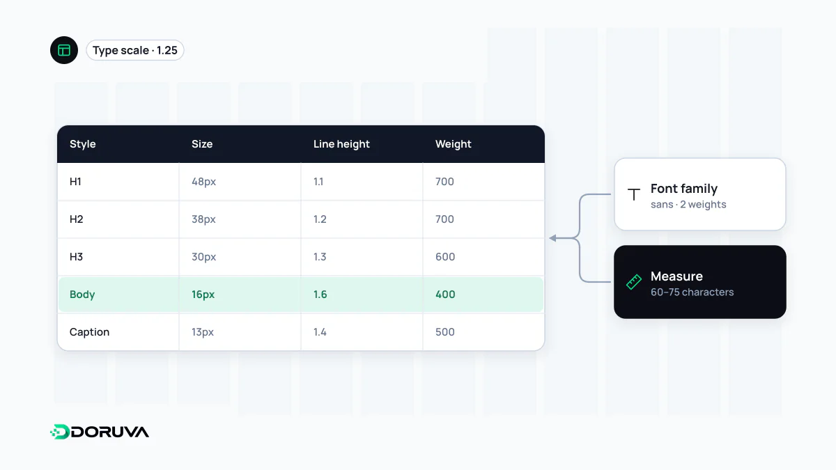
Keeping lines a readable length
On very long lines the eye loses its place when it sweeps back to the start of the next one; very short lines chop reading into fragments. The range most often recommended for body text is roughly 45 to 75 characters per line. WCAG 2.2 success criterion 1.4.8 (Level AAA) similarly asks that line width can be kept to no more than 80 characters, or 40 for Chinese, Japanese and Korean.
The simplest way to enforce this in CSS is to cap the text column in ch units. One ch is the width of the "0" glyph in the current font, so 65ch lands at roughly 65 to 75 characters of ordinary prose:
.article {
  max-width: 65ch;
  margin-inline: auto;
}
On wide screens, a narrow column with generous margins reads better than text stretched edge to edge, and still looks spacious.
Building a type scale
Instead of picking heading sizes one at a time, define a type scale: choose a base size and grow each step by a fixed ratio, such as 1.25. Expressed as design tokens, the same steps are shared by design files and code.
:root {
  --text: 1rem;                                 /* browser default is usually 16px */
  --h3: 1.25rem;
  --h2: clamp(1.5rem, 1.2rem + 1vw, 1.95rem);
  --h1: clamp(1.9rem, 1.4rem + 2.2vw, 2.45rem);
}
body { font-size: var(--text); line-height: 1.6; }
h1, h2, h3 { line-height: 1.2; }
clamp() lets headings scale fluidly with the viewport between a floor and a ceiling, which removes most of the breakpoint-specific font sizes. Around 1.5 is a sensible starting line height for body copy; large headings look better set tighter. These size steps are the backbone of a page's visual hierarchy.
Respecting the reader's settings
Some people raise their browser's default font size. Sizes set in rem rather than px carry that preference through the whole scale. Two WCAG 2.2 Level AA criteria apply directly. Under 1.4.4, text must be resizable up to 200 percent without loss of content or function. Under 1.4.12, nothing may break when a user overrides line height to 1.5 times the font size, paragraph spacing to 2 times, letter spacing to 0.12 times and word spacing to 0.16 times. Fixed-height boxes and cards with overflow: hidden are where this test fails most often. Legibility against the background is a separate question, covered under color contrast.
What web fonts cost
A custom typeface means extra downloads. Each weight and style is often its own file, so load only the ones you use, or switch to a variable font that packs a range of weights into one file. When a font arrives late, text is either hidden for a moment or shown in a fallback and then swapped; that swap can reflow lines and add to CLS. Loading strategies and font-display are covered in the web font entry.
Language-specific details
- Glyph coverage: subsetting a font to basic Latin saves bytes but drops characters such as Turkish ğ, ş, ı and İ or Polish ł, which then render in a fallback font in the middle of a word. Check that the subset covers every language you publish in.
- Case conversion:
text-transform: uppercasefollows the document language. Withoutlang="tr", the Turkish word "istanbul" becomes "ISTANBUL" instead of the correct "İSTANBUL". - Long words: German compounds or agglutinative languages can overflow narrow mobile columns.
overflow-wrap: break-wordon headings, andhyphens: autowith a correctlangattribute, reduce the risk.