

What is Color Contrast?
Definition
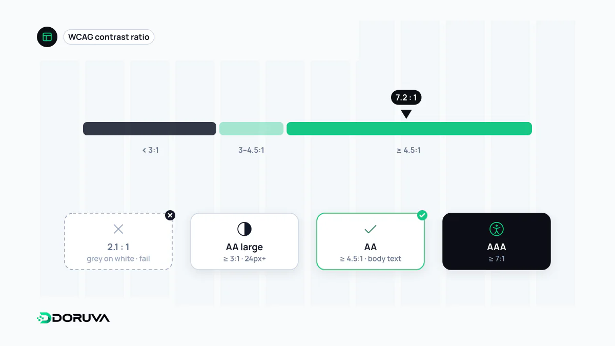
Color contrast is the difference in luminance between text or an interface element and its background, usually measured on the web with the contrast ratio defined in WCAG. The ratio runs from 1:1 (no difference) to 21:1 (black on white). WCAG 2.2 Level AA requires at least 4.5:1 for normal text, and at least 3:1 for large text and for non-text elements such as input borders and icons.
Also known as: contrast ratio, colour contrast, WCAG contrast
How the ratio is calculated
WCAG compares the relative luminance of two colours. Each colour is converted to a brightness value between 0 (black) and 1 (white), with the green channel weighted most heavily because the eye is more sensitive to green than to red or blue. The ratio is then:
contrast = (L1 + 0.05) / (L2 + 0.05)
L1: relative luminance of the lighter colour
L2: relative luminance of the darker colour
Results are not rounded; the W3C's Understanding document is explicit that 4.499:1 does not meet a 4.5:1 threshold. Hue plays no part. Red on green can have a perfectly good ratio and still be unreadable for someone with red-green colour blindness, while two very different hues can fail if they are similarly bright.
The thresholds in WCAG 2.2
| Criterion | Level | Applies to | Minimum |
|---|---|---|---|
| 1.4.3 Contrast (Minimum) | AA | Normal text | 4.5:1 |
| 1.4.3 Contrast (Minimum) | AA | Large text | 3:1 |
| 1.4.6 Contrast (Enhanced) | AAA | Normal / large text | 7:1 / 4.5:1 |
| 1.4.11 Non-text Contrast | AA | Boundaries and states of UI components, meaningful parts of graphics | 3:1 |
Large text means at least 18 point, or 14 point bold, which works out at roughly 24 CSS pixels, or about 18.5 pixels bold. Logos, purely decorative text and inactive components are exempt. The W3C's Understanding 1.4.3 page sets out the rules and exceptions in full.
Real colours, real results
| Foreground / background | Ratio | Verdict |
|---|---|---|
| #767676 grey text / white | 4.54:1 | Passes AA for normal text |
| #777777 grey text / white | 4.48:1 | Looks identical, fails for normal text |
| #595959 / white | 7.0:1 | AAA for normal text |
| White text / #F97316 orange button | 2.8:1 | Fails even for large text |
| White text / #C2410C dark orange | 5.18:1 | AA for normal text |
| #D1D5DB input border / white | 1.47:1 | Fails non-text contrast |
Two lessons stand out. Light grey body text tends to sit just below the line, and a bright brand colour usually needs a darker sibling before it can carry white button text. Defining those siblings once as design tokens saves recalculating on every screen.
Contrast beyond body text
- Form fields: if an input's border cannot be told apart from the page, people cannot see where to type.
- Focus indicators: keyboard users need a focus ring that contrasts with the colours around it.
- Icons and charts: an icon or chart line that carries meaning loses it below 3:1.
- Text over images: measure against the lightest part of the photo behind the text; a semi-opaque overlay is the most dependable fix.
- States and themes: hover, selected and error states each need checking, and dark mode is a separate palette to measure.
Contrast is not enough by itself: information must not be conveyed by colour alone (WCAG 1.4.1), so an invalid field needs an error message, not just a red border. Contrast is simply the most measurable slice of web accessibility.
Measuring it, and what may change
Colour pickers in browser developer tools and automated audits such as Lighthouse report contrast ratios directly. They often miss text on images and hover states, which need a manual check. WCAG 3.0 is still being drafted; the W3C working draft dated September 2026 states plainly that its contrast algorithm has yet to be determined. For conformance today, the WCAG 2.2 ratio is the measure that counts. Contrast also interacts with typography: thin, small type is harder to read than bold type at the same ratio.