

What is Visual Hierarchy?
Definition
Visual hierarchy is the arrangement of elements on a page so that their visual weight matches their importance, using size, colour, contrast, position, proximity and whitespace to lead the eye to the most important information first and the rest in order. Because most visitors scan rather than read, a clear hierarchy lets them grasp a page in seconds and find the main action without hunting for it.
Also known as: whitespace, white space, negative space, visual weight
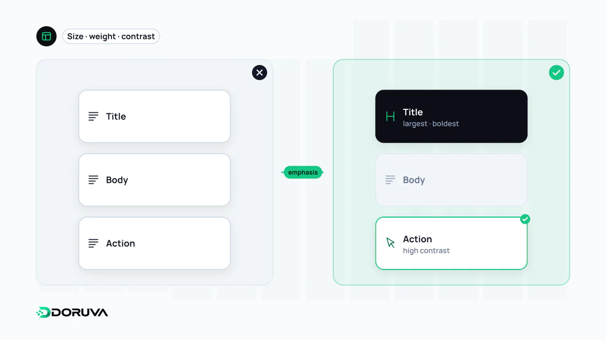
The levers that create weight
Nobody decides on a reading order when a page loads; the eye simply lands on whatever carries the most weight. Design is the deliberate distribution of that weight:
- Size: bigger gets seen first. If headings are only slightly larger than body text, both read as the same level.
- Weight and colour: bold type and saturated colour attract attention. If one accent colour is reserved for the primary action, it becomes a signpost on its own.
- Contrast: whatever stands apart from its surroundings stands out. Muting secondary text is a legitimate hierarchy tool, as long as it stays above the readability threshold (see color contrast).
- Position: in left-to-right languages, the top left and the first visible part of the page tend to get the most attention.
- Proximity and alignment: elements placed close together are read as one group. A shared grid system keeps those relationships consistent across pages.
- Repetition: items styled the same way are read as the same kind of thing, which is why cards in a list should look alike.
Whitespace is not wasted space
Whitespace (or negative space) is the empty area between and around elements, whatever its colour. It works at two scales. Micro whitespace is line spacing, letter spacing and the gap between a label and its input. Macro whitespace separates sections, columns and cards.
It is also the cheapest grouping device you have. Placing a form label closer to its own field than to the previous one makes the pairing obvious without boxes or rules. Adding room around an element makes it more prominent without making it bigger. The urge to "use the space" by filling every gap is usually the first thing that flattens a hierarchy.
Worked example: a pricing card
- Plan name and price: the largest, heaviest text, because that is what visitors compare.
- Primary action: a single button in the accent colour. Two equally weighted buttons leave the eye undecided; see call to action.
- What is included: regular body text in a short list.
- Terms and footnotes: smaller and lighter, but still legible.
To feature one plan as "most popular", a single difference (a coloured border or a badge) usually does the job. If every card emphasises something different, nothing stands out.
Not the same thing as heading structure
Making text look big and marking it up as <h2> are separate decisions. The coded heading structure tells screen readers and search engines how content is sectioned; visual hierarchy guides the eye. Ideally they agree, but never choose a tag for its looks. If a heading should appear small, use the correct level and shrink it with CSS; if a line of text should merely look large, style it rather than promoting it to a heading.
Testing whether the hierarchy works
- Blur test: blur the design or squint at it. The two or three things still visible when the text is unreadable are the page's actual hierarchy.
- Five-second test: show someone the page for five seconds, hide it, then ask what it was about and what they could do there. If the answers miss the page's purpose, the emphasis is in the wrong place.
- Greyscale check: convert the design to greyscale. A hierarchy that relies on hue alone falls apart.