

What is Call to Action (CTA)?
Definition
A call to action (CTA) is a button, link or short prompt that directs visitors to the next step a page is designed for, such as requesting a quote, signing up, buying or getting in touch. An effective CTA needs a label that says exactly what will happen, a visual weight that sets it apart from everything else, and a position that matches the moment of decision. It is judged by completed conversions, not by clicks alone.
Also known as: CTA, CTA button, call-to-action button
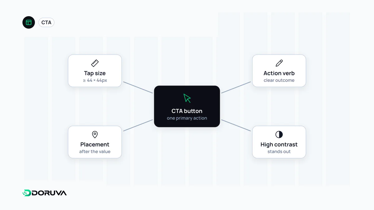
Label, weight and placement
The label should tell people what happens next. "Submit", "Continue" and "Click here" leave them guessing; "Request a quote", "Start free trial" or "Add to basket" name both the action and the outcome. A short line of microcopy beneath it ("No credit card needed", "Takes two minutes") answers the doubt that appears right at the moment of clicking.
Visual weight separates the primary action from everything else on the page through colour, size and surrounding space. Four equally loud buttons on one screen force visitors to work out for themselves which one matters. Secondary actions, such as "See pricing", get a quieter style.
Placement should follow the decision, not precede it. For a simple, familiar offer the right spot may be the hero section. For an expensive or complex service, repeat the CTA after the benefits, the process and the FAQ, where people have enough information to act.
Links go somewhere, buttons do something
They can look identical, but HTML treats them differently. A CTA that takes people to another page or URL is a link; one that performs an action on the current page is a button. Choose the right element and keyboard use, screen reader announcements and browser behaviour all work without extra effort.
<!-- Navigates: a link -->
<a href="/contact/">Request a quote</a>

<!-- Performs an action: a button -->
<button type="submit">Subscribe</button>

<!-- Avoid: a clickable div -->
<div onclick="go()">Request a quote</div>
Size matters on touch screens too. WCAG 2.2 success criterion 2.5.8 (level AA) asks for pointer targets of at least 24 by 24 CSS pixels, with some exceptions; main CTAs are more comfortable well above that minimum. W3C's Understanding document explains the exceptions.
Measure what happens after the click
Logging CTA clicks with event tracking is the start, but the metric that matters is the conversion that follows: the submitted form, the paid order, the activated trial. A CTA with lots of clicks and lots of abandoned forms is probably setting the wrong expectation. Rather than guessing whether a new label, colour or position helps, test it with an A/B test; on low-traffic pages, though, a meaningful result can take weeks.
When CTAs turn manipulative
Shaming decline links ("No thanks, I don't like saving money"), fake countdown timers and cancel links that are nearly invisible can lift clicks in the short term. They are known as dark patterns: they erode trust, drive refunds and complaints, and can conflict with consumer protection rules. A good CTA is honest about what happens next and makes the decision easier, not harder to refuse.