

What is Hero Section?
Definition
A hero section is the large introductory block at the very top of a web page, directly below the navigation, that tells visitors at a glance what the page offers. It usually holds the main heading (H1), a short value proposition, a primary call to action and a supporting image or video. Because it shapes the first impression and is often the largest visible element, it matters for both design and loading performance.
Also known as: hero banner, hero area, hero image, jumbotron
The job of the first block
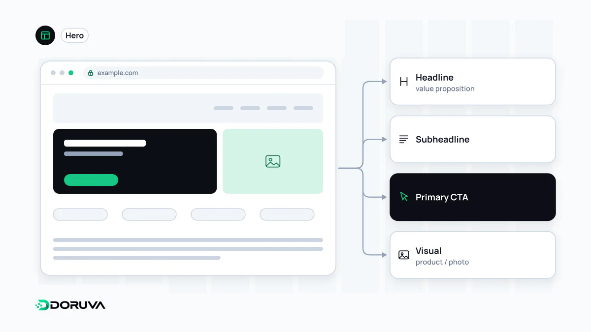
In the first seconds on a page, people want answers to three questions: am I in the right place, what can I do here, and why should I keep going? The hero section is where those answers live, which is why most heroes share the same skeleton:
- Headline: usually the page's only H1, naming the topic in words close to what the visitor searched for or clicked on.
- Supporting line: one or two sentences that make the headline concrete: who it is for and what it does.
- Primary action: a single, prominent call to action leading to the page's main goal, with an optional, visually quieter second choice.
- Visual: a photo, product screenshot or illustration showing the product, the result or the context of use.
- Trust signal (optional): client logos, a rating or a short testimonial.
Marking the hero headline as the H1 and continuing with H2 sections below gives the page a clear heading structure for readers and search engines alike.
It is usually your LCP element
The hero image or the large headline is typically the biggest element in the initial viewport, so it decides your Largest Contentful Paint. web.dev's guide to optimising LCP is blunt on two points: never lazy-load the LCP image, and use fetchpriority="high" to tell the browser which resource matters most.
<section>
  <h1>Invoice automation for finance teams</h1>
  <p>Reads incoming invoices, routes them for approval, posts them to your ERP.</p>
  <a href="/demo/">Book a demo</a>
  <img src="/img/dashboard-1200.avif"
       srcset="/img/dashboard-640.avif 640w, /img/dashboard-1200.avif 1200w"
       sizes="(width >= 64rem) 50vw, 100vw"
       width="1200" height="800"
       alt="Invoice approval screen"
       fetchpriority="high">
</section>
No loading="lazy", explicit dimensions so nothing shifts, and a srcset that sends phones a smaller file. Serving the image in a modern format at the right size is the single most effective piece of image optimisation on most pages. Baking the headline into the image as pixels, on the other hand, hurts accessibility and hides the text from search engines.
Sliders, video and full-screen heroes
Rotating sliders usually exist because several teams want the same spot. Content after the first slide is rarely seen, every slide adds image weight, and auto-advancing panels interrupt reading. One clear message tends to work better. Background video adds serious page weight; if you use it, keep it muted, short and compressed, provide a poster image, and pause it for visitors who prefer reduced motion. Full-viewport-height heroes push everything else out of the first screen, especially on phones, and visitors may not realise there is more below.
Legibility and focus
White text over a photo becomes unreadable the moment it lands on a light patch of the image. A semi-transparent overlay behind the text, or placing the text beside the image, keeps colour contrast safe at every screen size. The hero should stand apart from the rest of the page, but if five elements compete inside it, none of them wins. Rather than trying to fit everything above the fold, aim to show the page's promise and the first step, and let the rest follow.