

What is Image Optimization?
Definition
Image optimization is the practice of delivering a page's images at the smallest file size that still looks right, at the dimensions the layout actually needs and at the right moment. The core levers are choosing a suitable format (AVIF, WebP, JPEG, PNG or SVG), serving device-appropriate sizes, tuning compression, lazy loading offscreen images and declaring width and height.
Also known as: image compression, optimizing images, web image optimization, image optimisation
Why images dominate page weight
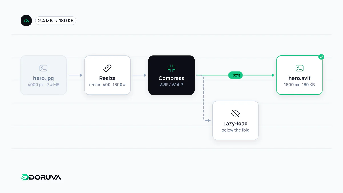
On most pages images account for the largest share of downloaded bytes, and the main content is often a hero photo. That makes image work one of the most direct ways to reduce page weight and improve Largest Contentful Paint. Bloated images are rarely the result of a single mistake. They usually come from five separate decisions: which format, how many pixels, how much compression, when to load and where to serve from.
Matching format to content
| Content | Good choice | Why |
|---|---|---|
| Photos and complex imagery | AVIF, WebP, JPEG | Lossy compression; AVIF and WebP typically reach the same quality in fewer bytes |
| Logos, icons, simple illustrations | SVG | Resolution-independent and sharp at any zoom level |
| Screenshots needing transparency or crisp detail | PNG or lossless WebP | No quality loss, at the cost of larger files |
| Animation | Video via <video> | An animated GIF is far heavier than the equivalent video |
AVIF and WebP work in all current browsers, and Google Images can index BMP, GIF, JPEG, PNG, WebP, SVG and AVIF. One thing no format fixes is text baked into a picture: it cannot be selected, searched or zoomed cleanly, so it belongs in HTML.
Right dimensions, sensible compression
The classic waste is a 4000-pixel camera original displayed in a 400-pixel card. The browser scales it down, but the visitor still downloads every byte. With responsive images you publish several widths and let srcset and sizes tell the browser which one fits. For lossy formats there is no universal quality number; compare variants visually and settle on the lowest setting where the difference stops being noticeable for that kind of image. Stripping metadata such as EXIF data removes a few more kilobytes.
<picture>
  <source type="image/avif" srcset="/img/team-640.avif 640w, /img/team-1280.avif 1280w" sizes="(min-width: 64rem) 50vw, 100vw">
  <img src="/img/team-1280.jpg"
       srcset="/img/team-640.jpg 640w, /img/team-1280.jpg 1280w"
       sizes="(min-width: 64rem) 50vw, 100vw"
       width="1280" height="853" loading="lazy" decoding="async"
       alt="Project team working at a whiteboard">
</picture>
The width and height attributes let the browser compute the aspect ratio and reserve space before the file arrives, which prevents the jumps measured by CLS. Even inside picture, keep an img fallback with a real src, because some browsers and crawlers ignore the other sources.
Loading order and delivery
Adding loading="lazy" to images below the fold postpones their download until the visitor scrolls near them. Applied to the hero image, the same attribute delays LCP; that image is a candidate for fetchpriority="high" instead. On the delivery side, an image CDN or image service can generate the requested width and format on the fly from a single master file and cache the result. That scales far better than asking editors to export five versions of every upload by hand.
Performance work versus image SEO
File size and format are performance concerns; being found in image search is a related but separate job. Descriptive file names, meaningful alt text and the surrounding copy fall under image SEO. Each needs the other: a fast image with a meaningless name and a beautifully labelled 3 MB image are both half-finished. For a quick pass, the SEO Checker reports image delivery findings alongside other performance issues.