

What is Above the Fold?
Definition
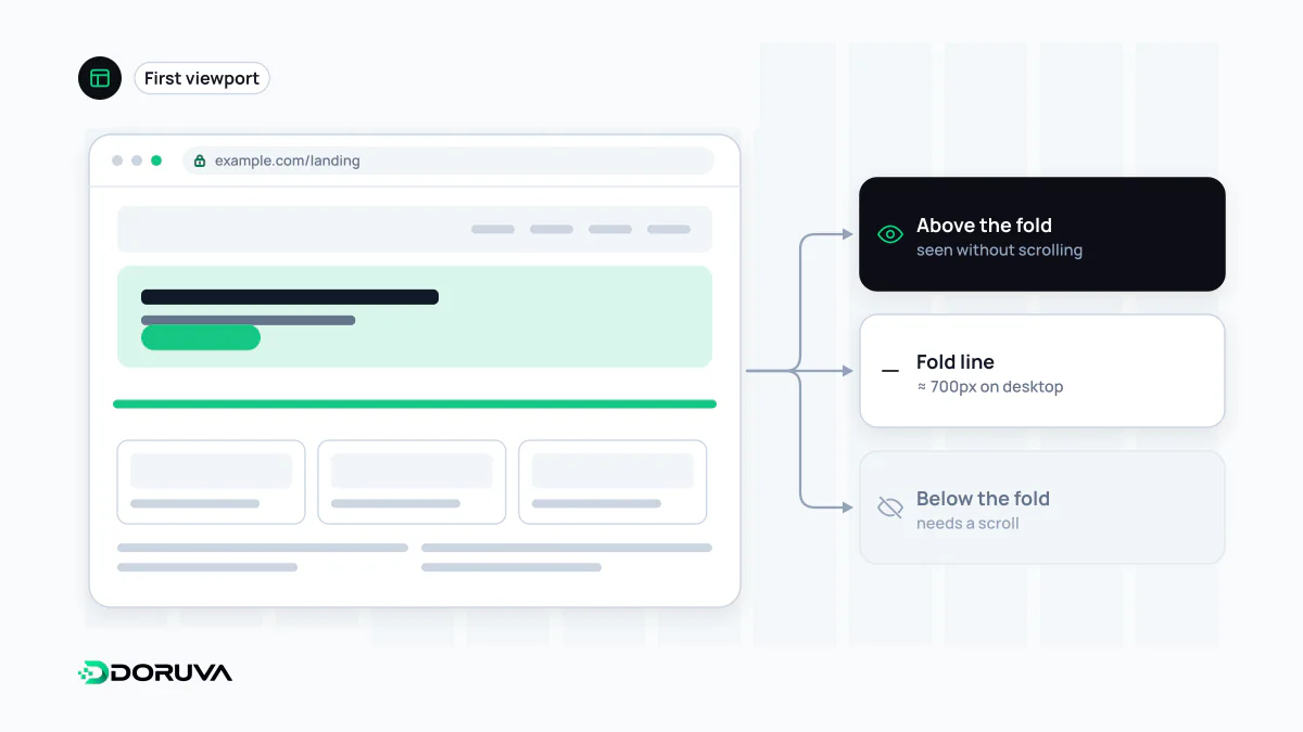
Above the fold is the part of a web page a visitor can see on load without scrolling. The term comes from newspapers, where the top half of a folded front page was what passers-by saw. On the web there is no fixed pixel line: the fold depends on the device, screen size and browser window. The page's main message, and usually its LCP element, sit in this area.
Also known as: the fold, first screen, initial viewport
From the newsstand to the browser
Broadsheet newspapers were displayed folded in half, so the headline and photo above the crease were what sold the paper. Editors put their strongest story there. Web designers borrowed the term for whatever is visible when a page first loads without scrolling, and everything beneath it is called below the fold.
There is no fixed fold line
A newspaper's fold is in one place; a screen's isn't. The first screen on a 360 px-wide phone, a 13-inch laptop and a tablet held upright shows very different content. Browser toolbars, bookmark bars, cookie banners and the user's zoom level change the visible height as well. Designing around a single number such as "the fold is at 600 px" is therefore misleading. A sounder approach is to look at real screen sizes in your analytics and review the first screen for the few most common viewports separately.
Another persistent myth is that people don't scroll. They do, as long as the first screen makes clear what the page offers and hints that there is more below. Trying to cram everything above the fold usually produces a crowded, hard-to-read header area.
What belongs on the first screen
- A clear heading and a short line saying what the page is about
- The primary action that fits the page's purpose: contact, buy, search, sign up
- Where useful, a visual cue inviting the visitor to scroll
Setting these priorities is a UX design decision, and there is no universal template: a product page and a long guide ask very different things of their first screen.
Why it matters for performance
LCP (Largest Contentful Paint) measures when the largest image or text block visible in the viewport is rendered, so the LCP element is almost always above the fold. Two practical rules follow:
- Don't lazy-load the main above-the-fold image. A hero image with
loading="lazy"waits until the browser has worked out the layout and confirmed the image is on screen, which delays LCP. Lazy loading is for content below the fold. - Prioritise the hero image. Making it discoverable directly in the HTML (rather than as a CSS background or a source set later by JavaScript) and marking it with
fetchpriority="high"helps the download start early.
<img src="/img/hero.webp" width="1200" height="600"
     alt="Dashboard overview" fetchpriority="high">
Banners, cookie bars or unsized images injected into the first screen after load push content down and worsen CLS. Google's page experience guidance also advises against intrusive interstitials that block access to the main content. For measurement and fixes, web.dev's guide to optimizing LCP is a solid starting point.
Checking your own pages
In developer tools, switch between a few device sizes, reload, and note what is visible without scrolling in each. Then identify the LCP element in the Performance panel or a Lighthouse report and make sure it isn't lazy-loaded and is present in the initial HTML response.