

What is Viewport?
Definition
The viewport is the rectangular area of a browser window in which a web page is currently visible. On desktop it follows the window size; on mobile it depends on the screen width and zoom level. CSS layout and units such as vw and vh are calculated against it. On mobile devices, the meta viewport tag in the HTML head tells the browser to lay the page out at the device's width.
Also known as: meta viewport, viewport meta tag, layout viewport, visual viewport
Layout viewport vs visual viewport
Browsers actually work with two viewports. The layout viewport is the area CSS uses to lay out the page: position: fixed elements, percentage widths and vw/vh units are resolved against it. The visual viewport is the part the user can actually see right now. When you pinch-zoom on a phone or the on-screen keyboard opens, the visual viewport shrinks while the layout viewport usually stays put. On desktop, without zoom, the two largely coincide.
JavaScript exposes the difference too: document.documentElement.clientWidth reports the layout viewport's width, while the window.visualViewport API reports the visible area's size, scroll offset and zoom scale. Keeping a fixed bottom bar in place when the keyboard opens is a typical job for that API.
Why the meta viewport tag exists
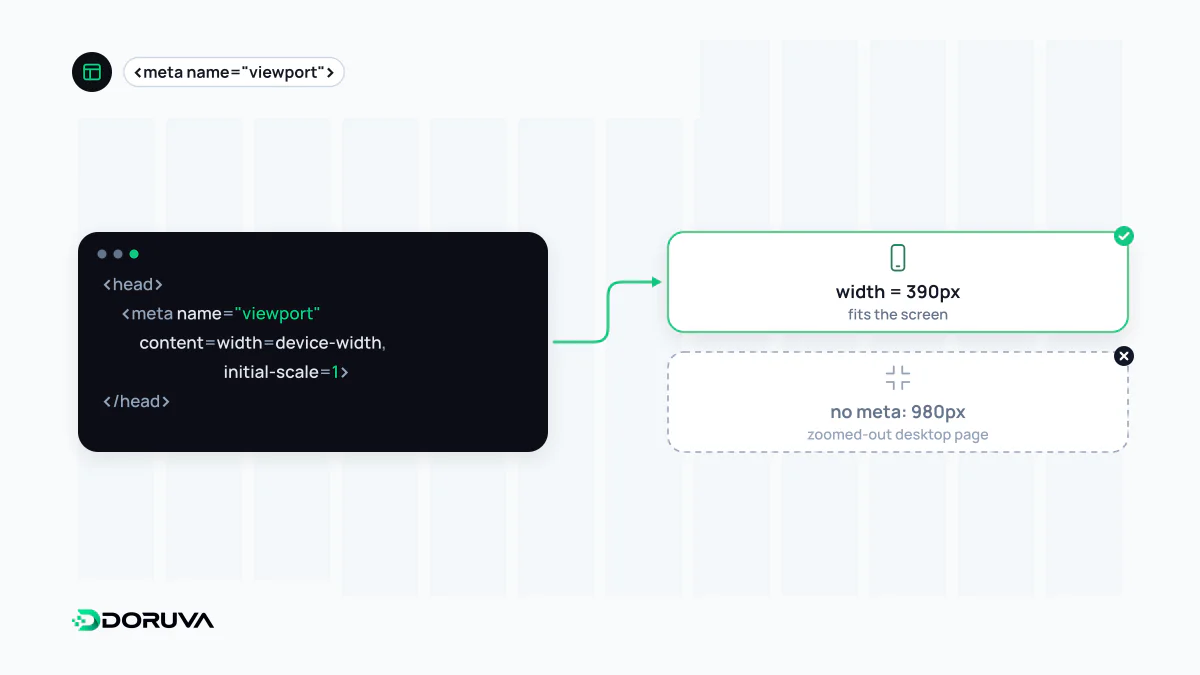
Early smartphone browsers had to display pages built for desktop, so they assumed a layout viewport much wider than the screen (980 px by default in iOS Safari) and scaled the result down. That fallback still applies today: without a viewport tag in the head, mobile media queries don't kick in as intended and text renders unreadably small. The standard declaration is:
<meta name="viewport" content="width=device-width, initial-scale=1">width=device-width sets the layout viewport to the device's width in CSS pixels, and initial-scale=1 opens the page without zoom. Responsive design doesn't work on phones without it, and because Google uses the mobile version of a page for mobile-first indexing, a missing tag directly affects how the site appears to both Google and users.
Common mistakes
- Disabling zoom: adding
user-scalable=noormaximum-scale=1stops users with low vision from enlarging text. This conflicts with the WCAG expectation that text can be resized, and some mobile browsers ignore these values anyway. - Hard-coding a width: a value such as
width=1024forces the same width on every device and causes horizontal scrolling on small screens. - Duplicate tags: when a theme and several plugins each add their own tag, unexpected values can win. A page should have exactly one.
- Using
100vhfor full-screen sections: on mobile, the visible height changes as the address bar hides and reappears.vhis typically based on the largest height (toolbars hidden), so the bottom of the content can end up off-screen.
The newer height units: svh, lvh, dvh
CSS added dedicated viewport units for exactly this problem, and all major browsers support them today:
| Unit | Based on | Typical use |
|---|---|---|
svh | The smallest height, with browser UI fully expanded | Intro sections that must never overflow |
lvh | The largest height, with browser UI retracted | Background imagery |
dvh | The current height, updated as the UI changes | Full-screen panels, modals |
Because dvh can be recalculated continuously while scrolling, using it on large layout blocks can cause visible jumps and extra layout work. svh is usually the more predictable default; reserve dvh for elements that really must fill the screen exactly.
How to check it
The quickest check is searching the page source for name="viewport". Device emulation in browser developer tools shows the effect at different widths, and Lighthouse flags tags that are missing or block zooming. Doruva's SEO Checker also verifies that the tag exists, follows the device width and doesn't disable zoom. For a deeper reference, see MDN's viewport concepts guide.