

What is Breakpoint?
Definition
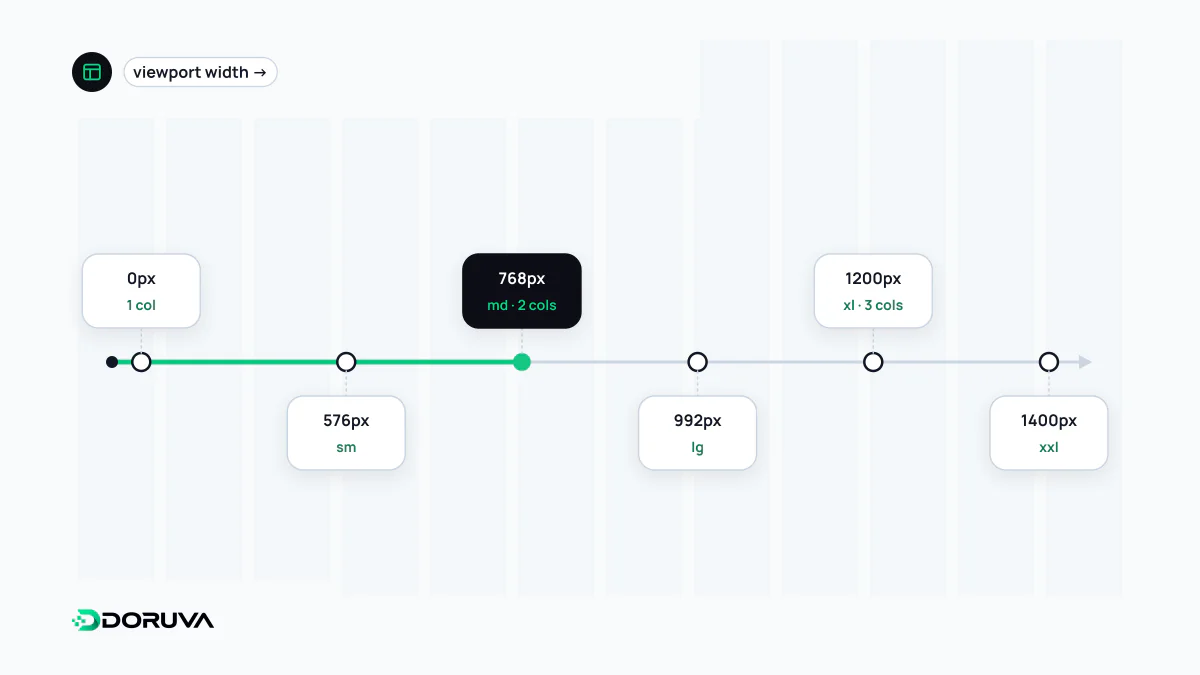
A breakpoint is a width threshold in a responsive design at which the layout changes, for example from a single mobile column to two columns from 768 pixels upward. In CSS it is usually expressed as a media query, or as a container query at component level. Well-chosen breakpoints follow the content, placed where the current layout starts to look cramped or stretched, rather than the dimensions of particular devices.
Also known as: responsive breakpoint, CSS breakpoint, media query breakpoint
Follow the content, not a device list
It is tempting to pick breakpoints as "phone, tablet, desktop", but device widths keep shifting and every width in between belongs to somebody's screen. A sturdier method is to start from the narrowest layout and slowly widen the browser window. The width at which lines become too long to read comfortably, cards spread out with awkward gaps or the menu no longer fits is that design's real breakpoint.
It helps to distinguish major breakpoints, which restructure the layout (one column becomes several, a collapsed menu becomes a horizontal bar), from minor tweaks that adjust a single component, such as a heading size or an image position. Keeping the number of major breakpoints small makes the system easier to maintain and to test.
What popular frameworks ship with
CSS frameworks come with a predefined set. These are sensible defaults, not standards:
| Name | Bootstrap 5.3 | Tailwind CSS |
|---|---|---|
| sm | 576px | 40rem (640px) |
| md | 768px | 48rem (768px) |
| lg | 992px | 64rem (1024px) |
| xl | 1200px | 80rem (1280px) |
| xxl / 2xl | 1400px | 96rem (1536px) |
Both are mobile-first: a prefixed class such as md: applies at that width and above. Android's window size classes for apps use a different scale: compact below 600dp, medium from 600 to 839dp, expanded from 840dp, plus larger classes beyond that.
Writing breakpoints in CSS
A breakpoint is written as a media query condition. Using em or rem instead of px helps the layout adapt along with the text when someone raises their browser's default font size:
/* 48em ≈ 768px at a 16px default font size */
@media (width >= 48em) {
  .site-header { flex-direction: row; }
}

/* Short viewports only, e.g. a phone in landscape */
@media (height < 30em) {
  .hero { min-height: auto; }
}
One limitation catches people out: CSS custom properties such as var(--md) cannot be used inside a media query condition. To manage breakpoint values in one place, teams use Sass variables, framework configuration or a design token build step. When design files and code share the same breakpoint names and values, "how does it look on tablet?" becomes a concrete question.
Space, not screen: container queries
A media query only knows the width of the viewport. The same card component, though, may sit in a wide main column on one page and a narrow sidebar on another. A container query lets the component respond to the width of its own container, moving breakpoints from the page to the component. In practice the two coexist: the page skeleton changes with media queries, the inside of each component with container queries.
Testing between the lines
- Check the widths between your breakpoints, such as 900px or 1100px, not just the thresholds themselves; that is where most layouts break.
- Try 320 CSS pixels. WCAG 2.2 expects content to reflow at that width without horizontal scrolling.
- Zoom the browser to 200 percent. Zooming shrinks the effective viewport width and triggers smaller breakpoints, which is often the first time anyone sees them on a desktop.
- Use real content. Long words and button labels that wrap onto two lines expose breakpoint needs that placeholder text never shows.
Breakpoints are only one tool within responsive design. The better the fluid widths and flexible layouts underneath, the fewer breakpoints you need.