

What is Container Query?
Definition
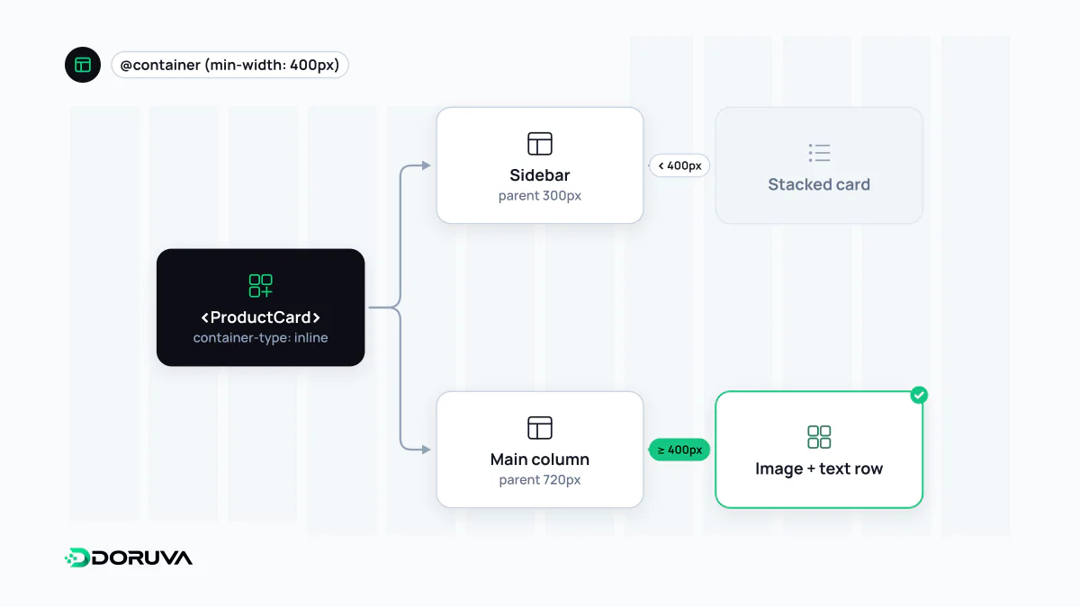
A container query is a CSS feature that styles an element based on the size (or, in some cases, the style) of its containing element instead of the browser viewport. You first turn an ancestor into a query container with container-type, then write conditions in an @container rule. The same component can then adapt its layout to the space it is given, whether that is a narrow sidebar or a wide content column.
Also known as: @container, CSS container queries, element queries, container queries
The problem viewport queries cannot solve
Take a product card that appears in a three-column grid on the home page, on its own in a wide category listing, and squeezed into a sidebar on a product page. A media query only knows the width of the window, so on a 1400-pixel screen it has no idea the sidebar card is just 280 pixels wide. For years the workaround was context classes such as .card--narrow and .card--wide, which every page had to remember to apply.
Container queries hand that information to the component itself. The card asks how much room its container gives it and picks a layout accordingly. Drop it anywhere and the same rules hold, which is what makes UI components genuinely portable.
A card that responds to its container
.card-slot {
  container-type: inline-size;
  container-name: card;
}

.card { display: grid; gap: 0.75rem; }

@container card (width >= 32rem) {
  .card {
    grid-template-columns: 12rem 1fr;
  }
  .card h3 {
    font-size: clamp(1.1rem, 0.9rem + 2cqi, 1.6rem);
  }
}
The element being measured is .card-slot; the element being styled is the .card inside it. That split matters, because an element cannot query its own size: the condition is always evaluated against the nearest eligible ancestor. Without a name the browser uses the nearest container; naming it removes ambiguity when containers are nested.
Choosing a container-type
inline-sizelets descendants query the inline dimension (width in horizontal writing). This is the value you will use most of the time.sizeallows width and height queries, but applies size containment on both axes, so the element no longer takes its height from its content. Without an explicit height it can collapse.normalis the default: not a size container, though still usable for style queries.
Size containment also means a container cannot be sized by its children. An element with inline-size needs its width to come from the surrounding layout, whether grid, flex or normal block flow, otherwise it may shrink to nothing inside a shrink-to-fit parent.
Units relative to the container
| Unit | Equals |
|---|---|
cqw / cqh | 1% of the container's width / height |
cqi / cqb | 1% of the container's inline / block size |
cqmin / cqmax | The smaller / larger of cqi and cqb |
If no eligible container exists, these units fall back to the small viewport units (svw, svh). Wrapping fluid type in clamp() keeps headings readable at both extremes.
Browser support today
Size queries are Baseline widely available on MDN and have worked in every major browser since February 2023. The @container rule has since gained two newer branches: style queries via style(), which in practice test custom property values on the container, and scroll-state() queries, which react to things like an element being stuck or scrolled. Support for these varies, so check the MDN compatibility table and write a default style that still looks acceptable when the query never matches.
Working alongside media queries
Container queries do not retire viewport queries. The page skeleton, such as how many columns the layout has or when the menu collapses, is still a decision about the window, handled with breakpoints in media queries. User preferences like reduced motion or a dark colour scheme are only exposed through media queries too. A sensible split in a design system is: page layout in media queries, component internals in container queries. That keeps responsive design decisions on two clean layers instead of one tangled stylesheet.