

What is CSS?
Definition
CSS (Cascading Style Sheets) is the style language that defines how a web page structured with HTML is presented. It keeps presentation decisions such as colour, typography, spacing, layout, animation and adaptation to different screen sizes in a separate layer from the content. Rules target elements through selectors, and when several rules conflict, the cascade, specificity and inheritance decide which value applies.
Also known as: Cascading Style Sheets, stylesheet, CSS3
Anatomy of a rule
HTML says what a page contains; CSS says what it looks like. Every rule pairs a selector (which elements?) with a declaration block (which properties, set to what?). The browser builds the DOM from the HTML and a parallel style model, the CSSOM, from the CSS, and what you see on screen is the combination of the two.
/* selector */
.product-card h2 {
  font-size: 1.25rem;      /* property: value */
  color: var(--text-color);
  margin-block: 0 0.5rem;
}
Styles can arrive three ways: an external file linked with <link rel="stylesheet">, a <style> block, or an element's style attribute. External files are usually the healthiest option for maintenance and caching, while inline styles can't be reused and are awkward to override.
The cascade, specificity and inheritance
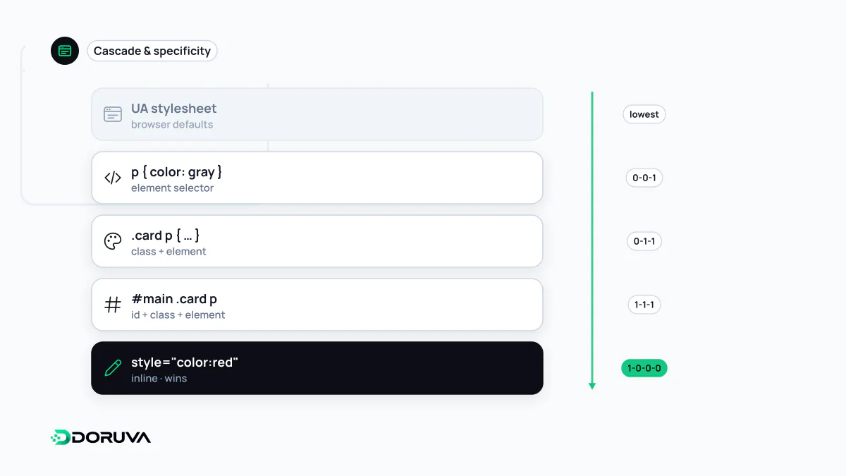
The "cascading" in the name is the conflict-resolution algorithm. When several rules target the same element, the browser weighs, in order: origin and importance (browser defaults, author styles, !important), cascade layers declared with @layer, selector specificity, and finally source order. An ID selector (#menu) beats a class selector, which beats a plain element selector.
Inheritance is a separate mechanism. Some properties, such as color and font-family, flow down to child elements; layout properties such as margin and border do not. Most styling bugs in large codebases come from misreading these rules. Forcing a fix with !important works today and makes tomorrow's change harder.
Layout and responsive tools
Floats and table hacks have given way to two layout systems: Flexbox for arranging items along one axis, and CSS Grid for two-dimensional layouts of rows and columns. A media query applies rules based on viewport characteristics, while a container query lets a component respond to the size of its own container. Together they are the technical backbone of responsive design.
CSS no longer ships as numbered versions. "CSS3" survives as a habit, but the W3C CSS Working Group develops the language as independent modules, such as Selectors, Grid and Color, each with its own level. Whether you can use a feature depends on support in the browsers you target, not on a version label.
Why CSS blocks rendering
To avoid painting an unstyled page and then repainting it, browsers by default hold off rendering until the CSSOM is ready, which makes CSS a render-blocking resource. One large stylesheet can noticeably delay the first paint, especially on slow mobile connections. The usual remedies:
- Inline the rules needed for the first screen in the HTML, an approach known as critical CSS.
- Link print-only or breakpoint-specific styles with a
mediaattribute; the browser still downloads them, at lower priority, but doesn't wait for them to render. - Remove unused rules and minify the file; shipping an entire CSS framework for a handful of components is a common waste.
- Reserve space for images and embeds; late-applied styles and unsized elements push content around and hurt CLS.
How search engines use CSS
When Google renders a page it fetches the stylesheets too, because that is how it understands mobile layout and where content sits on the page. Blocking CSS files in robots.txt can therefore lead to a page being misjudged. Using CSS to hide text from people while showing it to crawlers, such as text in the background colour or keyword blocks pushed off-screen, is explicitly listed in Google's spam policies. Content tucked into tabs or accordions that users can open is a different matter: that is a legitimate interface pattern.