

What is Media Query?
Definition
A media query is a CSS condition that applies styles only when the device or browser environment matches it. Conditions can test viewport width and height, orientation, the type of pointer, or user settings such as reduced motion and a dark colour scheme. Media queries are the core tool of responsive design and work in @media rules, in the HTML media attribute and in JavaScript through matchMedia().
Also known as: @media, CSS media queries, media queries
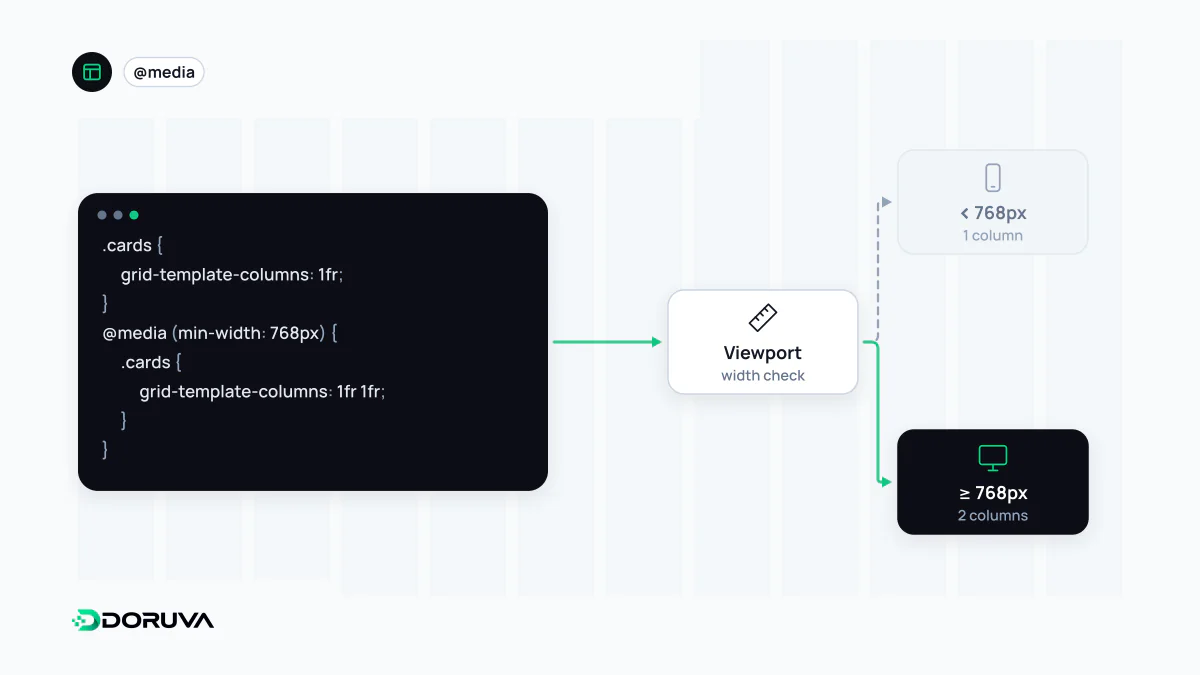
Anatomy of a media query
A media query can combine three things: an optional media type (screen, print or the default all), one or more media features in parentheses, and logical operators (and, not, or, and the comma) to join them. Most of the old media types such as tv and handheld are deprecated.
/* Traditional prefixes */
@media screen and (min-width: 48rem) and (max-width: 64rem) { … }

/* Range syntax: the same condition, easier to read */
@media (48rem <= width <= 64rem) { … }

/* Print stylesheet rules */
@media print {
  nav, .cookie-banner { display: none; }
}
The range syntax removes the classic off-by-one doubt of min-/max-: <= includes the boundary and < excludes it. All current major browsers have supported it since 2023.
Querying the user, not just the screen
Width is only part of the story. Media queries are the one CSS mechanism that can read accessibility and appearance settings from the operating system:
prefers-reduced-motionevaluates toreducewhen someone has asked the system to minimise animation. Large slides, zooms and parallax can trigger real discomfort for people with vestibular disorders.prefers-color-schemereports a light or dark preference.prefers-contrastsignals a wish for more (or less) contrast.hoverandpointerdescribe whether the primary input can hover and how precise it is. A menu that opens only on hover is unreachable on a touch screen.
@media (prefers-reduced-motion: reduce) {
  *, *::before, *::after {
    animation-duration: 0.01ms !important;
    transition-duration: 0.01ms !important;
    scroll-behavior: auto !important;
  }
}
A rule like this is a small, high-value step for web accessibility. MDN's reference lists where each operating system exposes the setting.
Media queries outside the stylesheet
The same condition language works in HTML and JavaScript. A <source media="(width >= 60rem)"> inside <picture> serves a different crop on wide screens, which is one half of responsive images. <link rel="stylesheet" media="print"> keeps print styles separate. In scripts, window.matchMedia("(prefers-color-scheme: dark)") returns whether a query currently matches and lets you listen for changes.
Media query or container query?
| Question | Tool |
|---|---|
| How many columns should the page have; when does the menu collapse? | Media query |
| Does the user want dark mode or less motion? | Media query |
| How should this card arrange itself in the slot it was placed in? | Container query |
Mistakes that keep coming back
- Device-named breakpoints. "iPhone width" changes every year. Put a breakpoint where the content starts to break, not where a particular phone ends.
- A missing viewport meta tag. Without
<meta name="viewport" content="width=device-width, initial-scale=1">, mobile browsers lay the page out in a wide virtual window and width queries never see the real size. The viewport entry covers why. - Building desktop first and undoing it. Cancelling a wide layout piece by piece with
max-widthqueries bloats the stylesheet. With mobile-first CSS the base styles target narrow screens andmin-widthqueries only add. - Pixel breakpoints only. Breakpoints in
emorremlet the layout respond when someone increases the browser's default text size.