

What is Flexbox?
Definition
Flexbox (CSS Flexible Box Layout) is a one-dimensional CSS layout model for arranging items along a single axis, either a row or a column, distributing space between them and aligning them. Setting display: flex on a container makes its children flexible, so they can grow or shrink according to their content and the space available. It is the typical tool for navigation bars, button groups and vertical centring.
Also known as: Flexible Box Layout, CSS Flexbox, display: flex, flex layout
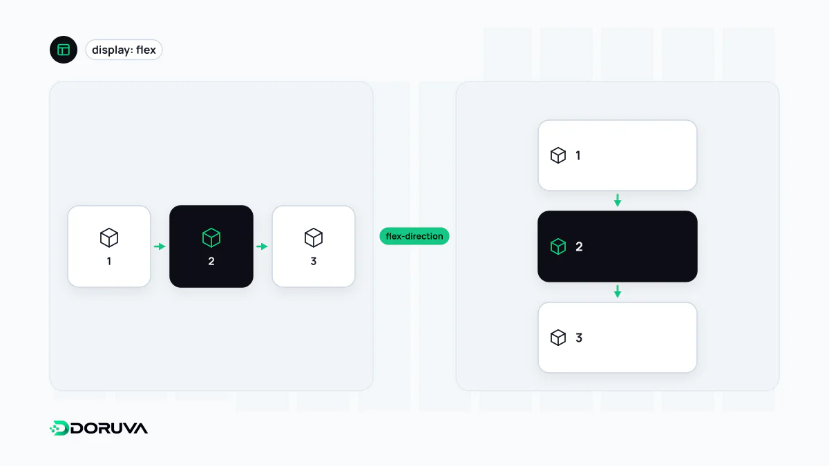
Main axis and cross axis
Everything in Flexbox is relative to two axes. The main axis is the direction items are laid out in, set by flex-direction: horizontal for the default row, vertical for column. The cross axis runs perpendicular to it. The alignment properties follow those axes:
justify-contentdistributes items along the main axis (start, end, centre, or with space between them).align-itemsaligns them on the cross axis (top, bottom, centre, stretched).gapsets the space between items without margin hacks.flex-wraplets items that do not fit move onto a new line.
Switch to column and the axes swap: justify-content now controls vertical distribution. Most Flexbox confusion traces back to that one detail.
What flex: 1 actually says
The flex shorthand bundles three values: how much an item may grow (flex-grow), how much it may shrink (flex-shrink) and the size it starts from (flex-basis).
| Shorthand | Expands to | Behaviour |
|---|---|---|
flex: 1 | 1 1 0% | Starts from zero, so free space is shared equally and items end up the same width regardless of content. |
flex: auto | 1 1 auto | Content size first, then the remaining space is shared; items with more content stay wider. |
flex: none | 0 0 auto | Neither grows nor shrinks; good for icons and fixed-width items. |
| default | 0 1 auto | Does not grow, but shrinks when space runs out. |
A typical job: the header bar
.top-bar {
  display: flex;
  align-items: center;
  gap: 1rem;
}
.top-bar .logo   { flex: none; }
.top-bar .login  { margin-inline-start: auto; } /* push to the end */

/* Let items wrap on narrow screens */
@media (width < 40em) {
  .top-bar { flex-wrap: wrap; }
}
margin-inline-start: auto pushes an item, and everything after it, to the far end of the line; it is one of the handiest small tricks in Flexbox. The same idea aligns an icon with its label inside a UI component, or pins a card's button to the bottom of the card (flex-direction: column plus margin-block-start: auto). How the menu itself should be organised is a site navigation question.
Grid or Flexbox?
MDN frames the choice as one question: do you need to control layout by row or column, or by row and column at once? The first is Flexbox territory, the second belongs to CSS Grid. Flexbox works from the content out, letting item sizes decide how space is used; Grid works from the layout in, defining a structure first and then placing items into it.
A practical tell: if you find yourself setting fixed widths on flex items so they line up with the row above, you are building a two-dimensional layout and Grid is probably the better fit. The two are not rivals. A page skeleton in Grid with Flexbox inside each cell is a perfectly normal combination.
Pitfalls worth knowing
- Overflowing text: a flex item's automatic minimum width is its content width, so a long URL or word can stop it from shrinking and cause overflow. Setting
min-width: 0on the item usually fixes it. - The stretched last row: in a wrapping card list, a lone card on the last line can stretch across the full width. If you want equal cells, Grid is the right tool.
- order and row-reverse: changing the visual order does not change the source order that keyboard focus and screen readers follow. Get the reading order right in the HTML.