

What is Grid System?
Definition
A grid system is the invisible framework of columns, gutters and margins used to place elements on a page. On the web its most common form is a 12-column grid whose column count drops as the screen narrows. A grid keeps alignment and spacing consistent across pages and gives designers and developers a shared vocabulary; in code it is usually implemented with CSS Grid or a framework.
Also known as: layout grid, column grid, 12-column grid, design grid
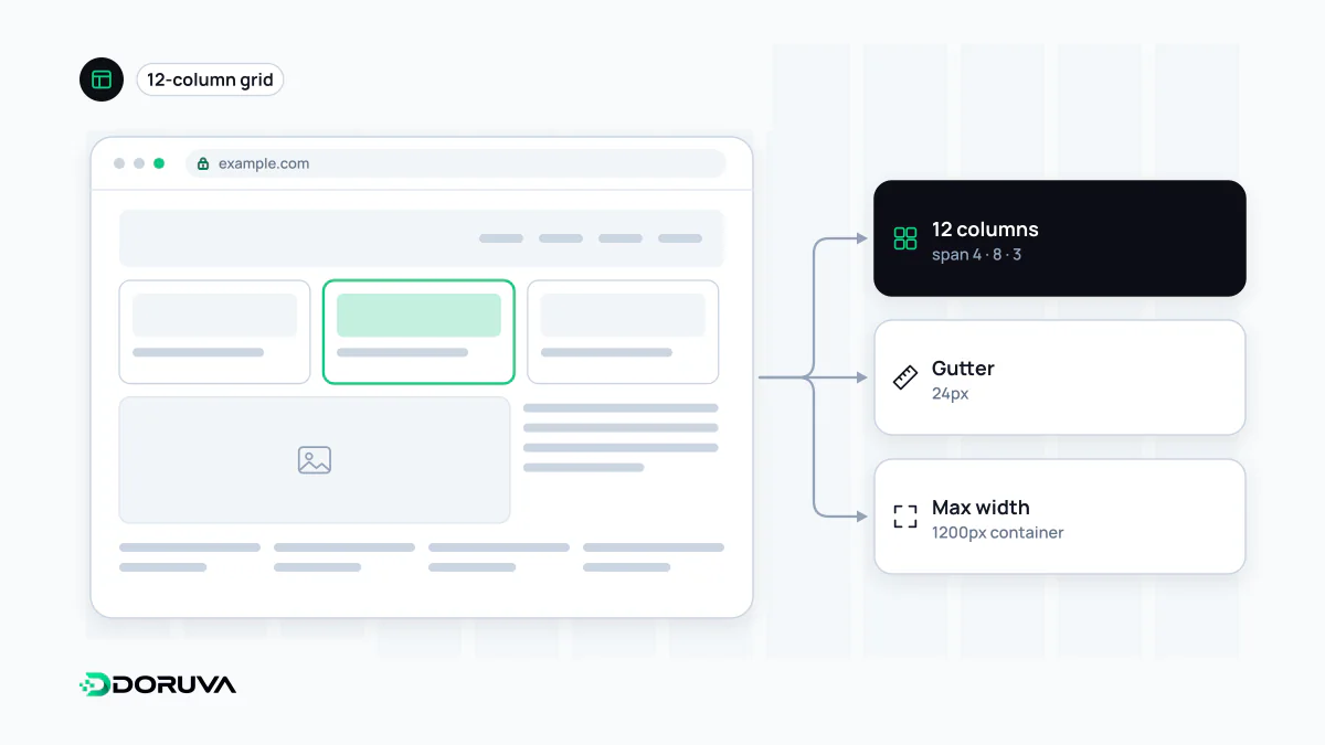
Anatomy of a layout grid
- Columns: equal-width vertical strips that content sits in. An element spans one or more of them.
- Gutters: the fixed gaps between columns, so content never butts up against its neighbour.
- Margins: the space between the grid and the edges of the screen, narrow on phones and more generous on large displays.
- Maximum width: a cap, say 1200 pixels and centred, so the grid does not stretch indefinitely on wide monitors.
You never see the grid itself, only its effect: the edges of elements line up on the same vertical lines all the way down the page. That alignment quietly supports visual hierarchy. On an orderly background, the one element that deliberately breaks out of the grid is the one people notice.
Why twelve?
Twelve divides evenly by 2, 3, 4 and 6. On a single grid you can build a split layout (6+6), a row of three cards (4+4+4), four feature boxes (3+3+3+3) or a main column with a sidebar (8+4). That flexibility is why widely used frameworks such as Bootstrap are built on 12 columns. Dense applications sometimes use 16 or 24 columns for finer divisions, while text-led sites can get by with far fewer.
Fewer columns on smaller screens
Twelve columns on a phone leave each column only a few pixels wide, so most design systems tie the column count to breakpoints. A common pattern is 4 columns on small screens, 8 on medium and 12 on large. A row of three cards then becomes 4+4+4 on desktop, two cards across eight columns on a tablet and a single stacked column on a phone. Drawing these decisions per width at the wireframe stage saves guesswork during development.
From design file to CSS
The column setup from a design tool translates into a few lines of CSS Grid. Stored as design tokens, the same measurements live in both the design file and the code:
.page {
  display: grid;
  grid-template-columns: repeat(12, minmax(0, 1fr));
  column-gap: 1.5rem;                /* gutter */
  padding-inline: 1rem;              /* margin */
  max-width: 75rem;
  margin-inline: auto;
}
.main    { grid-column: span 8; }
.sidebar { grid-column: span 4; }
minmax(0, 1fr) stops a long word or a wide image from inflating one column and throwing the whole grid off.
Grid system versus CSS Grid
They are not the same thing. A grid system is a design decision: how many columns, how much space, how it behaves at each width. CSS Grid is one of several browser features you can implement it with; the same grid system can be built with Flexbox or a framework's utility classes. A consistent spacing unit, such as multiples of 4 or 8 pixels, is usually considered part of the grid and documented in the design system. Treat the grid as a reference rather than a cage: a deliberate exception, such as an image bleeding to the edge, reads as intentional precisely because everything else is aligned.