

What is Design Token?
Definition
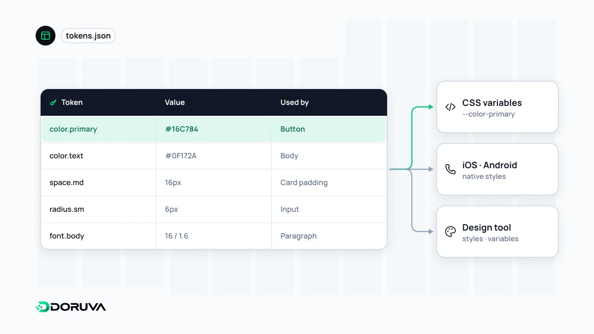
A design token is a named value that stores one design decision, such as a colour, spacing step, font size, corner radius or animation duration, and is the smallest unit of a design system. Tokens live in a platform-neutral source, usually JSON, and are transformed into CSS custom properties, iOS and Android code. The same decision can then be managed in one place across design tools, the web and native apps.
Also known as: design tokens, design variables, DTCG tokens, style tokens
Primitive, semantic and component tokens
Tokens often begin as a flat list of values, but a growing system becomes unmanageable without tiers. The common model has three:
| Tier | What it expresses | Example name |
|---|---|---|
| Primitive (global) | The raw values available, with no context | color.teal.700, space.300 |
| Semantic (alias) | What a value is used for | color.text.muted, color.border.danger |
| Component | A decision specific to one component | button.primary.background |
Components reference semantic or component tokens only, never primitives directly. Thanks to that rule, a question like "which red is our danger colour?" is answered by changing one mapping, and no component code is touched.
Names that describe purpose
A semantic token's name should say what the value is for, not what it is. color.blue-dark starts lying the day the brand turns green; color.action.primary stays true. A naming order that works well in practice is category → object or property → variant → state, as in color.background.surface.hover. Skip the naming convention and you will soon have muted, subtle and secondary all meaning the same thing in one codebase.
The DTCG format
For years every design tool and transformer had its own JSON shape. The Design Tokens Community Group, a W3C community group, set out to fix that and published its first stable format, version 2025.10, on 28 October 2025. It is a Final Community Group Report; in its own words it is not a W3C Standard and is not on the W3C Standards Track. Even so, it has become the shared reference point for tool makers.
{
  "color": {
    "teal": {
      "700": {
        "$type": "color",
        "$value": { "colorSpace": "srgb", "components": [0.06, 0.46, 0.43] }
      }
    },
    "action": {
      "primary": {
        "$type": "color",
        "$value": "{color.teal.700}",
        "$description": "Primary buttons and emphasised links"
      }
    }
  },
  "space": {
    "300": { "$type": "dimension", "$value": { "value": 0.75, "unit": "rem" } }
  }
}
Reserved properties start with $: $value holds the value, $type the type (color, dimension, duration, fontFamily, shadow, typography and others) and $description a human-readable note. The curly-brace form {color.teal.700} creates an alias. The recommended file extensions are .tokens and .tokens.json. The full rules are in the specification.
From source file to platform code
Browsers never read the token file directly. A build step translates it into whatever each platform understands. On the web, that usually means CSS custom properties:
:root {
  --color-teal-700: #0f766e;
  --color-action-primary: var(--color-teal-700);
  --space-300: 0.75rem;
}
The same source can produce Swift constants for iOS and XML resources for Android. Keeping it in JSON means changes can be reviewed line by line in version control and synced automatically between the design tool and the codebase.
Themes, modes and knowing when to stop
A dark theme, a high-contrast mode or a second brand is built by remapping the semantic tier to different primitives, while components stay untouched. Each remapping needs its own colour contrast check: a pair that passes on a light background can fail on a dark one. The opposite mistake is tokenising every number. A measurement used once in a single illustration only bloats the list until nobody knows which token to pick. Tokens are for values that repeat and need a shared decision. For the wider framework they are governed in, see design system.