

What is Design System?
Definition
A design system is a shared, documented set of reusable components, design tokens and guidelines that a team uses to build a product's interfaces consistently. It typically combines a component library in code, matching design files, and rules for usage, accessibility and content, and is run as a living product with its own owners and versions.
Also known as: UI design system
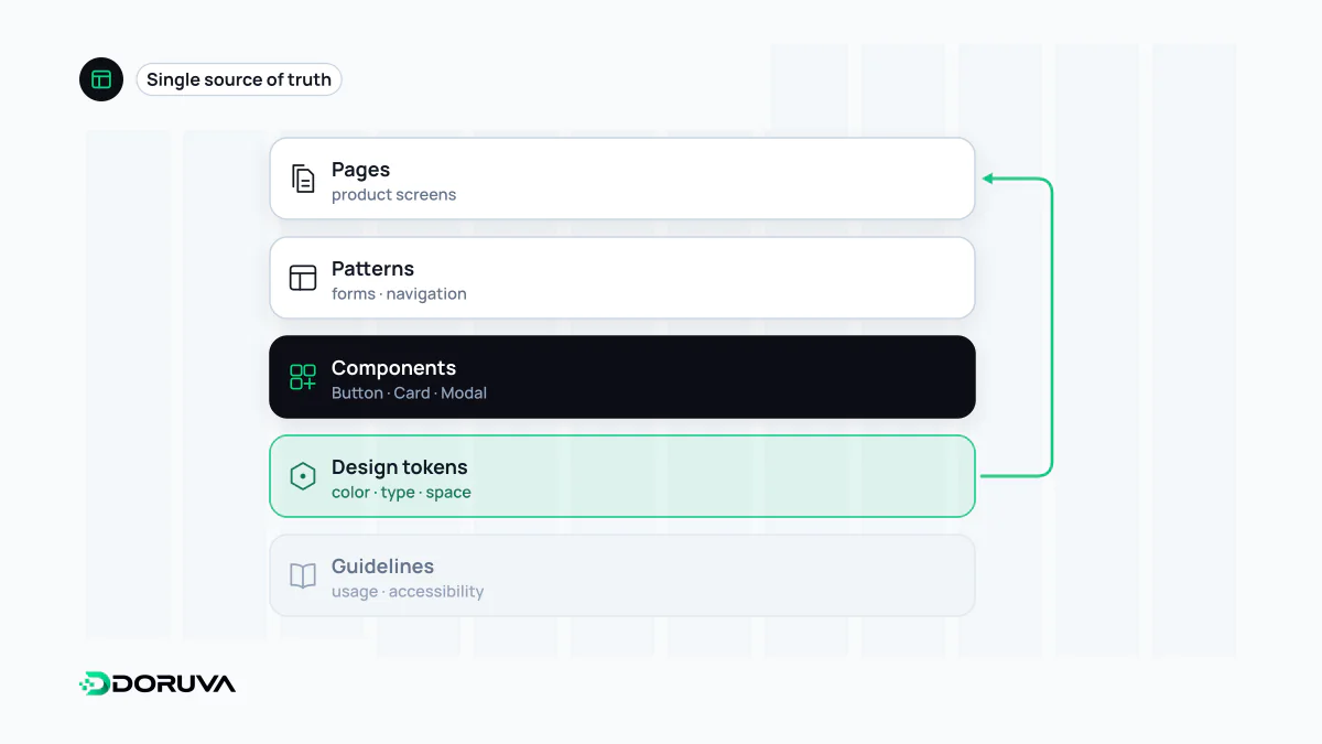
What sits inside a design system
A design system isn't a single file but a set of connected parts:
- Design tokens: named values for the smallest design decisions, such as colour, spacing, type size, corner radius and shadow.
- Components: buttons, inputs, cards, dialogs and so on, in both design files and code, with all of their states.
- Patterns: recurring combinations of components, for example how a form and its error messages fit together.
- Guidelines: when to use which component, accessibility rules, voice and tone.
- Documentation and governance: a reference site, release notes, and a process for proposing and approving changes.
Design tokens in code
Tokens keep each design decision in one place and let every part of the product refer to it by the same name. A simple example with CSS custom properties:
:root {
  /* Primitive tokens: raw values */
  --blue-600: #1d4ed8;
  --space-4: 1rem;

  /* Semantic tokens: what the value is for */
  --color-action: var(--blue-600);
  --radius-control: 6px;
}

.button {
  background: var(--color-action);
  padding: calc(var(--space-4) / 2) var(--space-4);
  border-radius: var(--radius-control);
}
The component points at the semantic token, not at the raw colour. When the brand colour changes or a dark theme arrives, only token values are updated instead of hundreds of components. A W3C community group, the Design Tokens Community Group, is also working on a shared format for exchanging tokens between design tools and platforms.
Style guide, UI kit, component library, design system
| Term | Scope |
|---|---|
| Style guide | Brand and visual rules: logo, colour palette, typography |
| UI kit | Ready-made interface parts in a design tool, often with no code counterpart |
| Component library | Reusable interface components in code |
| Design system | All of the above plus tokens, guidelines, documentation and governance |
When it pays off
With several products, a growing team or many page templates, a design system earns its keep quickly: the same button isn't rebuilt five different ways, new screens are assembled from existing parts, and an accessibility fix made once in a component reaches every page that uses it. For a one-page brochure site a full system is usually overkill; a handful of tokens and a few well-defined components may be all you need. A practical starting point is to collect the parts that already repeat in your interface and consolidate them.
A design system makes UI design decisions durable and shareable, and it bakes responsive behaviour into components instead of rethinking it on every page.
Common mistakes
- A system that lives only in design files. Without a code counterpart, design and product drift apart over time.
- No owner. If nobody maintains it and nobody knows how changes get approved, it goes stale fast.
- Making it too rigid, so teams that can't meet their needs build workarounds outside the system.
- Skipping documentation; without guidance on when to use what, different components end up doing the same job.
- Treating accessibility as each team's problem. Focus states, labels and contrast should be right inside the component from the start.