

What is UI (User Interface)?
Definition
UI (user interface) is the part of a digital product people see and interact with: screens, layouts, buttons, forms, menus, icons, typography and colour. UI design is the discipline of shaping these elements so they are clear, consistent and responsive to every input, turning a product's structure and flows into a usable visual interface.
Also known as: user interface, UI design, user interface design, interface design
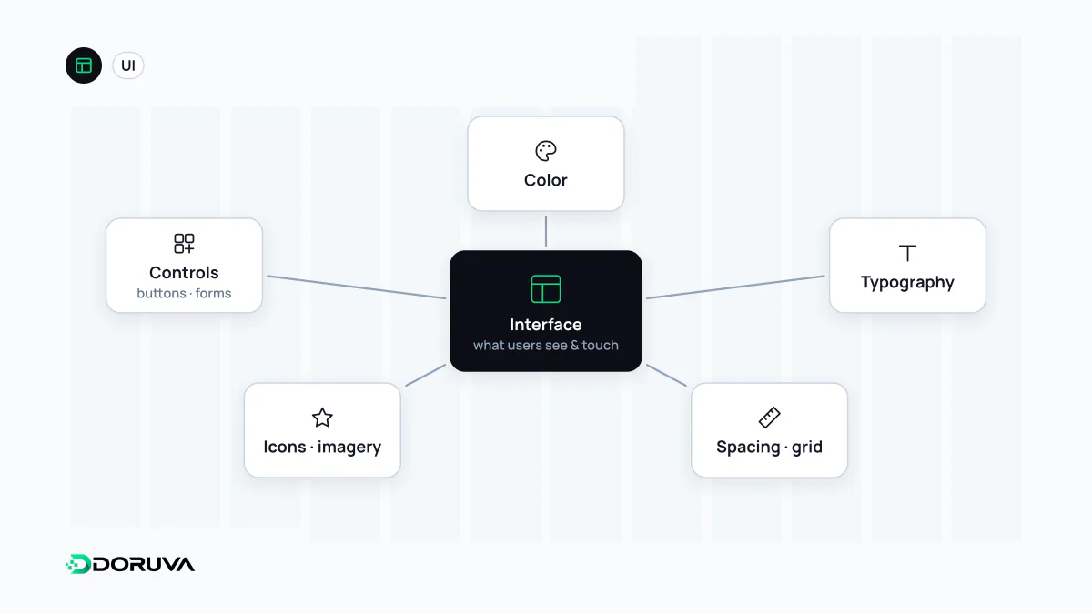
What a UI designer actually decides
Interface design is less about making a screen pretty and more about making every element explain, at a glance, what it is and what it does. The typical decisions are:
- Visual hierarchy: where the eye lands first, set through size, contrast, whitespace and position.
- Typography: typefaces, a type scale, line height and line length.
- Colour and contrast: functional use of brand colours for actions, warnings, errors and success, and legibility.
- Spacing and grid: consistent gaps, alignment and column structure.
- Components: recurring parts such as buttons, inputs, cards, tabs and dialogs.
- States and feedback: how an element looks when hovered, focused, loading or in error.
- Motion: transitions and micro-interactions that explain what changed without stealing attention.
Where UI ends and UX begins
The two terms often travel together, but they answer different questions. UX decides whether checkout takes three steps or five and what each step asks for; UI decides how those steps look and behave on screen.
| UI design | UX design | |
|---|---|---|
| Core question | How should this screen look and respond? | How does the user reach their goal with the least friction? |
| Typical outputs | Mockups, UI kits, component specs | Research findings, user flows, wireframes |
| Focus | Visual language, components, interaction detail | Needs, information architecture, task flows |
On small teams one person often does both. What matters is knowing which question a given decision is answering.
Example: one button, six states
Design files frequently show a button only in its default state. In a real interface the same button needs at least six: default, hover, keyboard focus, active (pressed), disabled and loading. For someone navigating by keyboard, the focus state is the only clue to where they are:
.button:focus-visible {
  outline: 3px solid #1a56db;
  outline-offset: 2px;
}
Defining those states once and reusing the same component everywhere is one of the main jobs of a design system.
Principles that hold up
- Consistency: the same function looks the same and sits in the same place on every screen.
- Clear affordances: what is clickable is distinguishable from what isn't; links are marked by more than colour alone, for example an underline.
- Feedback: every action has a visible result. Was the form sent? Where is the error? Is something still loading?
- Legibility: enough contrast between text and background. WCAG, the web accessibility standard, asks for at least 4.5:1 for normal text at level AA.
- Adaptability: components hold together at every screen width, which is the interface side of responsive design.
Common mistakes
- Removing the focus
outlineentirely for aesthetic reasons. - Using placeholder text instead of a label, so the field's purpose disappears once someone starts typing.
- Icon-only buttons whose meaning users have to guess.
- Low-contrast choices such as grey text on a light grey background.
- Too many font sizes and colour shades; a small, systematic scale reads more calmly.
- Designing only the happy path and forgetting empty lists, error messages and unusually long text.