

What is UI Component?
Definition
A UI component is a self-contained, reusable building block of an interface, such as a button, form field, card or menu, that bundles its markup, styling, behaviour and accessibility rules into one unit. It exposes a small interface of parameters (props), hides its internals and behaves the same wherever it is used. Components exist both in design files and in code written with frameworks like React.
Also known as: component, interface component, reusable component, front-end component
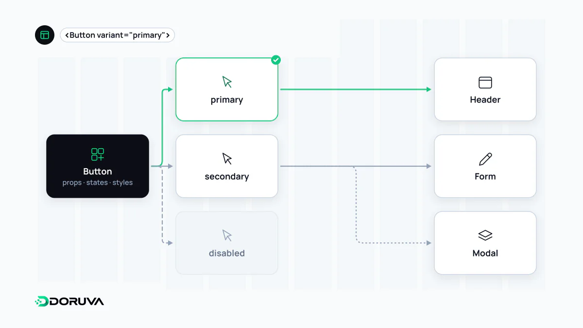
What a component is made of
Treated as a component, a "button" is much more than a picture of a button:
- Interface (props): what a consumer is allowed to change, such as
variant,sizeordisabled. - States: default, hover, keyboard focus, pressed, disabled, loading, error. Any state not drawn in the design file gets guessed at in code.
- Variants: visual flavours of the same function, such as primary, secondary and text buttons.
- Slots: places where other content, an icon, a label or a nested component, can be passed in.
- An accessibility contract: the right HTML element, a visible focus ring, a meaningful accessible name.
The same button in React
type ButtonProps = {
  variant?: "primary" | "secondary";
  loading?: boolean;
  children: React.ReactNode;
} & React.ButtonHTMLAttributes<HTMLButtonElement>;

export function Button({ variant = "primary", loading = false, children, ...rest }: ButtonProps) {
  return (
    <button
      type="button"
      {...rest}
      className={"btn btn-" + variant}
      aria-busy={loading || undefined}
      disabled={loading || rest.disabled}
    >
      {children}
    </button>
  );
}
This tiny component makes several decisions once, for everyone: it renders a real <button> so keyboard and screen reader support come for free, it defaults to type="button" so it never submits a surrounding form by accident, and it announces loading through ARIA. Colour and spacing come from design tokens rather than raw values. Teams using it never have to think about any of that.
Designing the props, not just the pixels
A component's props are a small API, and a badly designed one causes trouble at every call site. Some rules of thumb:
- Few, meaningful options. Dozens of independent booleans like
isBig,isRed,hasIconandisRoundedmultiply into hundreds of untested combinations. Mutually exclusive choices belong in a singlevariant. - Composition over configuration. Accepting content through
childrenor slots keeps a component lean, instead of adding a new prop for every request. - No style leakage. A component should not depend on the CSS of the page it sits on, or it will look different on every page.
- Documented states. Each state needs a written description of how it looks and when to use it.
Framework components and Web Components
The idea of a component belongs to no single framework. React, Vue, Svelte and Angular each have their own component model; in React, components describe what the next render should look like and the library applies the differences to the page, a process usually explained through the virtual DOM. The browser's built-in Web Components standards (custom elements, shadow DOM, templates) let you write framework-independent components that work on any page. Whichever route you take, the value lies in a stable contract.
From component library to design system
Individual components are collected into a library; add tokens, usage guidelines and an ownership process and you have a design system. Atomic design is a popular mental model for deciding what size of building block you are dealing with. Two failure patterns show up again and again: clickable divs styled to look like buttons, and three different card components doing the same job side by side. Both quietly undo the consistency that components were meant to deliver.