

What is CSS Grid?
Definition
CSS Grid (CSS Grid Layout) is a two-dimensional CSS layout model for arranging elements in rows and columns at the same time. Setting display: grid on a container defines column and row tracks, and child elements are placed into them automatically or by line numbers and named areas. It suits page skeletons, card collections and any layout where items must align in both directions better than Flexbox does.
Also known as: CSS Grid Layout, grid layout, display: grid
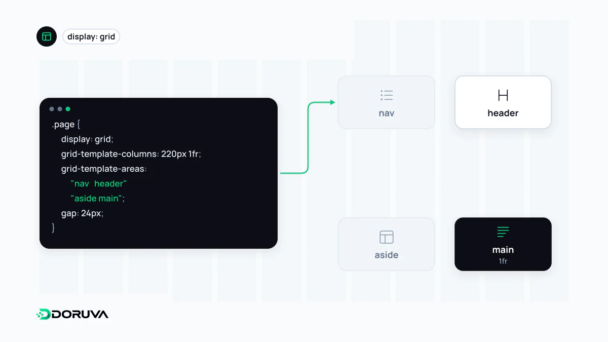
Tracks, lines and the fr unit
With Grid you define the layout on the container first and then place items into it. Columns and rows are called tracks, and the boundaries between them are numbered lines. The fr unit is a share of whatever space is left once fixed sizes and gaps are taken out:
.layout {
  display: grid;
  grid-template-columns: 16rem 1fr 2fr;  /* fixed, then 1/3 and 2/3 of the rest */
  gap: 1.5rem;
}
.feature {
  grid-column: 2 / 4;   /* from line 2 to line 4: spans two columns */
}
A card list that adapts without media queries
Combining repeat(), minmax() and auto-placement gives you a list that works out its own column count from the available width:
.cards {
  display: grid;
  grid-template-columns: repeat(auto-fill, minmax(min(16rem, 100%), 1fr));
  gap: 1rem;
}
Each card is at least 16rem wide, and as many columns open as will fit. The inner min(16rem, 100%) keeps a card from overflowing its container on very narrow screens. The difference between auto-fill and auto-fit only shows when there are few items: auto-fill keeps the empty columns in place, while auto-fit collapses them so the existing cards stretch. This pattern removes the need for many breakpoints.
Named areas for a page skeleton
grid-template-areas makes a layout readable almost like a sketch, and rearranging it at a breakpoint becomes a matter of redrawing the map:
.page {
  display: grid;
  grid-template-areas:
    "head"
    "main"
    "side"
    "foot";
}
@media (width >= 60em) {
  .page {
    grid-template-columns: 1fr 18rem;
    grid-template-areas:
      "head head"
      "main side"
      "foot foot";
  }
}
header { grid-area: head; }
main   { grid-area: main; }
aside  { grid-area: side; }
footer { grid-area: foot; }
Subgrid for aligning nested content
Getting the titles, text and buttons of side-by-side cards to line up is a classic problem, because each card lays out its contents independently. A child given grid-template-rows: subgrid adopts the parent grid's tracks instead of creating its own, so the buttons sit on one line even when the descriptions differ in length. According to MDN, subgrid has worked across all major browsers since September 2023. When a component should respond to its own container rather than the page, Grid pairs well with a container query.
Visual order versus source order
Grid can place items in any cell regardless of their order in the HTML. That power has a cost: keyboard and screen reader users experience content in source order, not visual order. If the menu appears on the left but comes last in the markup, tabbing through the page jumps around unexpectedly. Build a sensible reading order in the HTML and use Grid for presentation only; that is the safe route for web accessibility.
For one-dimensional alignment, such as a row of buttons or a navigation bar, Flexbox is usually the simpler tool. The design-side column structure itself is covered under grid system.