

What is Critical CSS?
Definition
Critical CSS is a technique that extracts the style rules needed to render the first visible part of a page, inlines them in the HTML, and loads the rest of the stylesheet in a way that does not block rendering. The goal is to let the browser paint initial content without waiting for an external CSS file. Its main trade-offs are that inlined styles cannot be cached separately and must be kept in sync with the design.
Also known as: critical path CSS, inline critical CSS, above-the-fold CSS
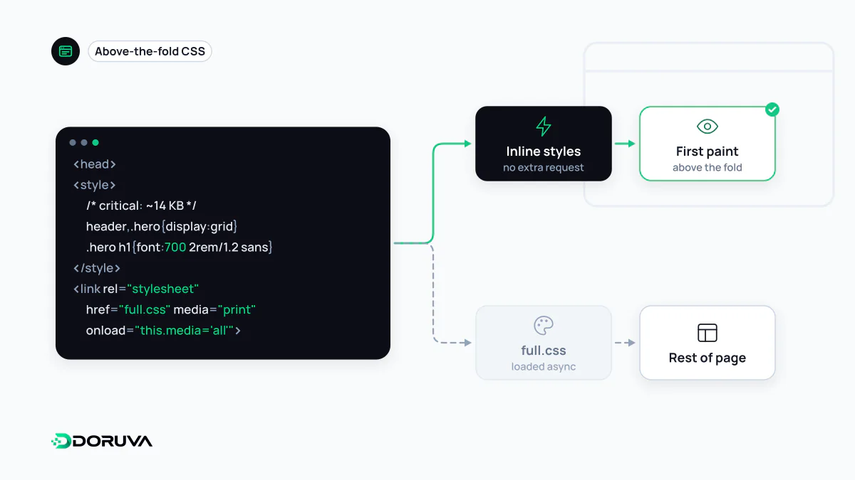
Why stylesheets hold back the first paint
Browsers don't paint until every stylesheet in the <head> has been downloaded and parsed. That is deliberate, since the alternative is a flash of unstyled content followed by everything snapping into place. The cost is that one 150 KB site-wide stylesheet delays the first paint until its last byte arrives, even when the first screen only uses a fraction of its rules. It is one of the most common bottlenecks on the critical rendering path.
Critical CSS splits that file in two: a small slice needed for the first view ships inside the HTML, and the large remainder loads in the background without blocking.
What the pattern looks like
<head>
  <style>
    /* first screen only: header, hero, base type */
    body{margin:0;font-family:system-ui,sans-serif}
    .site-header{display:flex;align-items:center;height:64px}
    .hero{min-height:60vh}
  </style>
  <link rel="preload" href="/css/site.css" as="style"
        onload="this.onload=null;this.rel='stylesheet'">
  <noscript><link rel="stylesheet" href="/css/site.css"></noscript>
</head>
The inline block makes the first paint possible. The full stylesheet downloads without blocking via preload and is switched to rel="stylesheet" once it arrives; the noscript tag covers environments without JavaScript. Because the swap relies on an inline event handler, a strict Content Security Policy that forbids inline script will block it; in that case, do the swap from an external script instead.
Choosing critical rules by hand is tedious and error-prone. web.dev points to tools such as Critical, CriticalCSS and Penthouse, which render the page at given viewport sizes and extract the rules that apply to visible elements. Mobile and desktop first screens differ, so extraction should cover several resolutions.
The 14 KB guideline
web.dev suggests keeping above-the-fold content under 14 KB compressed. The reasoning is TCP slow start: on a new connection, the server can send roughly that much data in the first round trip. If the HTML and its critical CSS fit, the browser can paint without waiting for a second round trip. Treat it as a rule of thumb that keeps the critical slice honest, not a hard limit.
Trade-offs, and when to skip it
- No separate caching. Inlined styles travel with every HTML response instead of being cached once as a file.
- Heavier HTML. The bigger the inline block, the later the rest of the document arrives. If everything is critical, nothing is.
- Drift and layout shifts. When the design changes and the critical slice doesn't, elements jump as the full stylesheet applies, which hurts CLS. In practice this makes an automated build step close to mandatory.
- Small stylesheets. If your total CSS is a few kilobytes and well cached, the extraction effort may not produce a measurable gain.
Confirm the diagnosis first. If FCP is slow and Lighthouse lists your stylesheet among render-blocking resources, critical CSS is the right lever. If the delay comes from a slow server response, reorganising styles alone won't fix it.