

What is Dark Pattern?
Definition
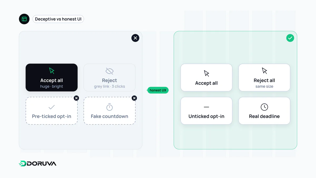
A dark pattern is a user interface pattern designed to push people into decisions that work against their own interests. Pre-ticked consent boxes, fees revealed only at the final checkout step, fake countdown timers, subscriptions that are deliberately hard to cancel and cookie banners that hide the reject option are typical examples. The practice is now often called deceptive design, and consumer protection and data protection regulators in several jurisdictions have taken it up.
Also known as: deceptive design pattern, deceptive pattern, deceptive design, manipulative design
Persuasion versus deception
Every interface nudges. Highlighting the primary button, shortening checkout or surfacing reassuring information are legitimate design choices. A dark pattern starts where the nudge works against what the person knows or wants. The test is simple: if the user fully understood what they were choosing and what would follow, would they still choose it? If not, the design is not persuading them; it is misleading them.
UX specialist Harry Brignull coined the term in 2010. The catalogue he started under the name darkpatterns.org now runs as “Deceptive Patterns”, reflecting a wider shift towards calling the practice deceptive design.
A field guide to common patterns
- Preselection: newsletter sign-up, add-on insurance or a donation arrives already ticked.
- Hidden costs: service fees or delivery charges appear only on the last checkout screen.
- Fake urgency and scarcity: timers that reset on every visit, “only 2 left” banners with no stock data behind them.
- Hard to cancel: subscribing takes two clicks; cancelling needs a phone call or a maze of retention screens.
- Confirmshaming: the decline link reads “No thanks, I don't like saving money”.
- Visual interference: a large colored “Accept” button next to a faint grey “Reject” text link.
- Sneaking: an item or service the user never selected appears in the basket.
- Trick wording: double negatives that make it hard to tell what a checkbox actually does.
The cookie banner problem
Consent banners are where most people meet deceptive design. One click accepts everything; rejecting requires opening a settings panel and switching off dozens of toggles one by one. That asymmetry sits uneasily with the requirement that cookie consent be freely given, and under the GDPR consent that was engineered rather than chosen may not hold up. The European Data Protection Board's Guidelines 03/2022 on deceptive design patterns in social media interfaces, finalized in February 2023, walk through many such cases with concrete examples.
Regulators are paying attention
- European Union: the Digital Services Act bans deceptive interface design by online platforms, such as misleading consent buttons and aggressive pop-ups.
- United States: the Federal Trade Commission published its staff report “Bringing Dark Patterns to Light” in September 2022.
- Türkiye: in August 2023 the Ministry of Trade announced that its Advertising Board was examining “dark commercial designs”, which are addressed as unfair commercial practices through an amendment to the regulation on commercial advertising and unfair commercial practices. Preselected options and making other choices deliberately harder were cited as examples.
This overview is informational, not legal advice. Whether a specific design complies with the rules in a given market is a question for a qualified lawyer.
Questions for a design review
- Is the full price visible before the final checkout step?
- Do accept and reject options carry the same visual weight and take the same number of clicks?
- Is cancelling as easy as signing up?
- Are urgency and stock messages backed by real data?
- Does every pre-ticked box clearly benefit the user?
A dark pattern can lift a conversion rate for a quarter. Refund requests, chargebacks, complaints and lost trust usually take that gain back with interest.