

What is Information Architecture?
Definition
Information architecture (IA) is the structural design of a website or app: how its content is grouped, what those groups and pages are called, and how people move between them. It covers organisation schemes, labelling, navigation and search. Good IA lets users find what they need without thinking about it, and the same structure, expressed through internal links and URLs, shapes how search engines understand the site.
Also known as: IA, site architecture, site structure
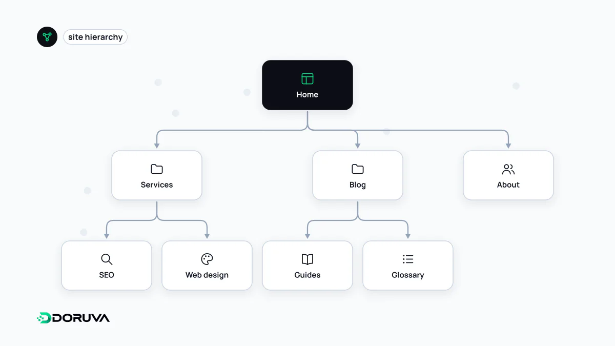
The four systems behind every structure
You never see information architecture directly. It is the sum of the answers a site gives to "what is here, where is it, and what is it called?" Practitioners usually split it into four systems:
- Organisation: the logic used to group content, whether by topic, audience, task, location or date. Mixing schemes in one menu ("Products", "Enterprise Customers", "2026 Campaign") forces visitors to guess which bucket something landed in.
- Labelling: the names given to groups and links. A label works when it matches the word the visitor already has in mind.
- Navigation: main and secondary menus, breadcrumbs, footers and in-context links. Site navigation has its own entry.
- Search and classification: on-site search, filters and taxonomy structures such as categories and tags, which take over where a menu alone cannot cope, typically in large catalogues.
Example: the skeleton of a studio website
/                          Home
/services/                 Services (hub)
  /services/web-design/
  /services/seo/
  /services/custom-software/
/work/                     Case studies
  /work/<project-name>/
/blog/                     Blog
  /blog/<post-name>/
/contact/
Here the hierarchy, the URLs and the menu tell the same story: a service page sits under "Services" in the menu and in the address. That alignment is not mandatory, but it helps people and crawlers orient themselves. The opposite is common too: "Solutions" in the menu, /offer/ in the URL and "What we do" in the breadcrumb are three names for one thing.
Validating the structure with real users
Most IA arguments can be settled with UX research rather than opinion:
- Open card sorting: participants sort content cards into groups they invent and name themselves. It shows how users think about the content and which words they use for it.
- Closed card sorting: the groups are given; participants place cards into them. It tests whether existing categories make sense.
- Tree testing: participants get a text-only version of the menu tree and tasks like "Where would you find X?". Because there is no visual design to lean on, it isolates the structure and shows exactly which branch people get lost in.
Where IA meets SEO
Search engines infer much of a site's structure from its links. Google states that it can generally only crawl a link if it is an <a> element with an href attribute, which makes menus that open only through JavaScript click handlers a real risk. Its SEO Starter Guide also notes that grouping similar topics in directories can help Google learn how often URLs in each directory change.
The practical consequences: keep important pages a few clicks from the home page (see crawl depth), make sure no page is left without inbound links, connect related content with contextual internal links, and use link text that says where the link goes. A clean architecture does not guarantee rankings, but a messy one makes even strong content harder to find and to interpret correctly.
Labelling mistakes that keep recurring
- Internal jargon: what the team calls a "Digital Growth Package" may be what visitors search for as "online shop".
- Vague containers: "Solutions", "Resources" and "More" say nothing about what is inside.
- Overlapping groups: if a page plausibly belongs under two menu items, a share of visitors will pick the wrong one. Sharpen the groups, or link the page from both places.
- Mirroring the org chart: a menu built around internal departments reflects how the company is organised, not what visitors came to do.