Web Design
How to Design a High-Converting Landing Page: A 12-Point Checklist
A high-converting landing page rests on one goal, a message that matches the campaign, and a clear call to action above the fold. This checklist walks through 12 points you can use to design a new page or audit an existing one, with examples.
By Mehmet ÇalışırPublished 10 min read
Contents
This guide is for marketing teams and business owners who want visitors from ads, email and social campaigns to turn into enquiries, bookings, sign-ups or sales. Use the 12 points below as a plan when you design a new page, or as an audit when you review one that is already live.
What is a high-converting landing page, and how is it different from a home page?
A high-converting landing page is a standalone page designed to move visitors from a specific campaign towards a single action. Your home page introduces the whole brand and offers many paths; a landing page presents one offer and leaves one path open.
That difference changes every design decision. On a home page, the menu, service list and blog links are helpful. On a landing page, each extra link is an exit that pulls the visitor away from the one thing you want them to do.
| Criterion | Home page | Landing page |
|---|---|---|
| Purpose | Introduce the brand and all services | Get one action for one offer |
| Traffic source | Mixed: search, direct, referrals | Mostly a specific campaign |
| Navigation | Full menu and many links | Minimal, often no menu |
| Message | Broad and inclusive | Identical to the campaign's promise |
| Measure of success | Engagement and browsing depth | Conversion rate and cost per conversion |
Landing pages are often planned as part of a company website or built separately for campaign periods. If you are setting a budget, scoping them in from the start makes life easier; we explain what moves the numbers in our guide to what drives the cost of a business website.
Which decisions come before any design work?
A good landing page starts with two decisions made before the first sketch: what the page has to achieve, and what the visitor expects when they arrive. If either is fuzzy, even polished design will carry a scattered message.
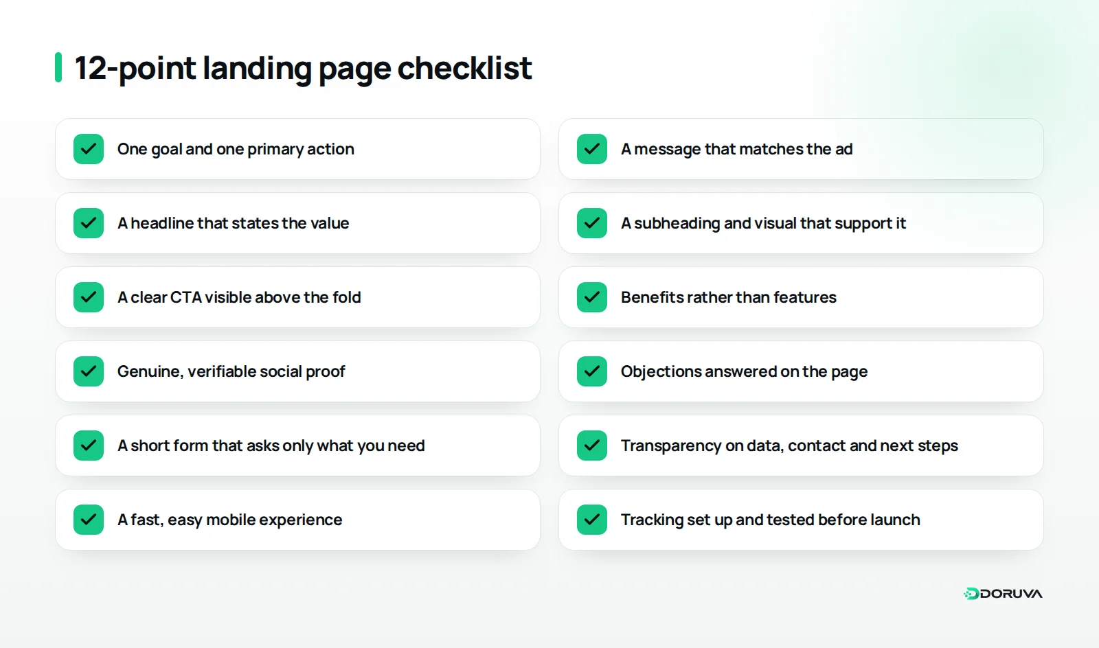
1. Choose one goal and one primary action
The page should collect a quote request, book an appointment or sell a product, not all three. Secondary actions such as a phone call are fine as long as they serve the same goal. For a dental practice promoting implants, the primary action might be “Book a free consultation”; a newsletter sign-up or a list of blog posts on that page only distracts.
Once the goal is set, write down how success will be measured: which action counts as a conversion, for traffic from which campaigns, and over what period. That definition keeps the design team and the ads team focused on the same outcome, and it makes the tracking in point 12 much easier to set up.
2. Match the message to the traffic source
Whatever the visitor saw in the ad, they should see on the page. If the ad says “Try our accounting software free for 14 days”, the headline should repeat that promise in the same words. Rather than sending every campaign to one generic page, give each core message its own page, or at least its own headline, so visitors immediately feel they have landed in the right place.
What belongs above the fold?
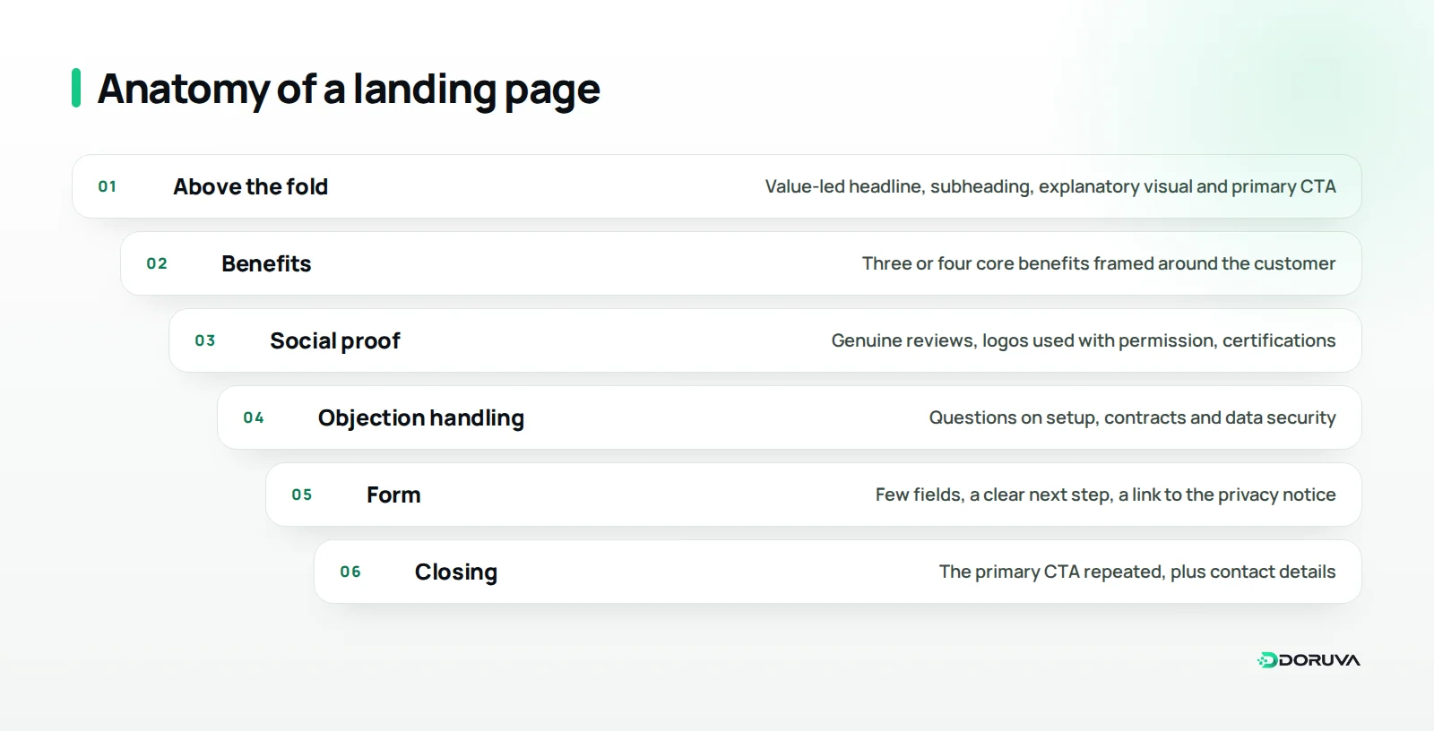
The area a visitor sees before scrolling is where most of them decide whether to stay. It should show your value proposition, a short line that supports it, and the primary call to action together.
3. Say what the value is in the headline
The headline should say what you offer and what the visitor gains, in one sentence. Swap abstract lines like “Solutions for tomorrow” for something concrete, such as “Manage every clinic appointment from one screen”. Read it aloud: would someone who never saw the campaign understand what you sell? Borrow your customers' own words where you can; the phrases that keep coming up in sales calls, reviews and support tickets usually describe the need best.
4. Back the headline with a subheading and a visual
The subheading answers the question the headline leaves open: who it is for, how it works, on what terms. The image in the hero section should explain, not decorate. A product screen for software, or an image of the outcome or process for a service, says far more than a generic stock photo.
5. Make the primary call to action visible and specific
Your main call to action (CTA) should be visible on the first screen and say what happens next. “Get my free quote” beats “Submit”, and “Pick a demo slot” beats “Click here”. On longer pages, repeat the same CTA at the end of key sections so people who decide halfway down don't have to scroll back up.
How does the page actually persuade?
Persuasion means answering, in order, the questions in the visitor's head: Is this for me? Can I trust them? What's the risk? The middle of the page handles those questions with benefits, proof and objection handling.
6. Lead with benefits, not features
A feature says what the product does; a benefit says what changes for the customer. “Automatic SMS reminders” is a feature. “Fewer patients missing their appointments” is a benefit. Tie every feature to a benefit and put the three or four that matter most up front.
7. Use genuine social proof
Customer reviews, client logos used with permission, certifications and awards build trust, but only when they are real and verifiable. Invented testimonials or logos used without permission put both your credibility and your legal position at risk. Some regulated sectors, healthcare among them, may have specific rules on testimonials and advertising, so check before you publish.
Place proof next to the claim it supports. A review about a smooth setup, sitting beside the section that promises quick onboarding, does far more than a block of general testimonials at the bottom of the page.
8. Answer objections on the page
Visitors want to see answers to “Is setup difficult?”, “Am I locked into a contract?” and “Is my data safe?” before they ever speak to sales. Collect the questions your sales and support teams hear most often, and answer them in a short Q&A block or right under the relevant benefit.
Forms and trust: how do you reduce friction?
The form is the moment of decision, and the moment people give up; every unnecessary field and every unanswered doubt makes giving up more likely. The aim is to get what your team genuinely needs while asking as little of the visitor as possible.
9. Keep the form short and ask only for what you need
For each field, ask whether you will actually use that information at first contact. For a B2B software demo, name, work email and company are often enough; headcount or budget range can wait for the first call. If a longer form is truly necessary, splitting it into steps with a progress indicator makes it feel lighter.
Keep field labels visible above each box; placeholder text that vanishes as soon as someone starts typing makes it hard to check what they've entered. Show error messages right next to the field, and say exactly what needs fixing.
10. Be transparent about data, contact and next steps
Next to the form, say what happens after someone submits it. A clear expectation such as “We'll call you within one business day” is far more reassuring than silence. If you collect personal data, link to your privacy notice, and where consent is required, ask for it with a separate, unticked checkbox. The exact requirements depend on your market, whether that is the GDPR in Europe or KVKK in Turkey, so get legal advice for your case. A real address, phone number and company details also add credibility.
Why do speed, mobile usability and tracking matter so much?
Even a well-structured page fails if it loads slowly, is awkward on a phone, or can't tell you what's working. Because a large share of campaign traffic arrives on mobile devices, these technical basics have a direct effect on conversion.
11. Make it fast and easy to use on mobile
Design for the phone screen first: the headline and CTA should be visible straight away, buttons should be easy to tap, and form fields should bring up the right keyboard, such as a number pad for phone numbers. Optimise large images and avoid unnecessary scripts and heavy animation. Our guide to Core Web Vitals covers the speed metrics and how to improve them, and our free SEO checker gives you a quick technical health check of the page.
12. Set up tracking before you launch
Define and test your conversion events before the page goes live: form submissions, button clicks, phone calls and thank-you page views. Add campaign parameters to your links so you can see which ad, email or post actually produced results. Without tracking, every change you make is a guess.
How do you keep improving the page after launch?
Launch is the start, not the end: real visitor data begins to show what works and what doesn't. Sound improvement is built on hypotheses and tests rather than hunches.
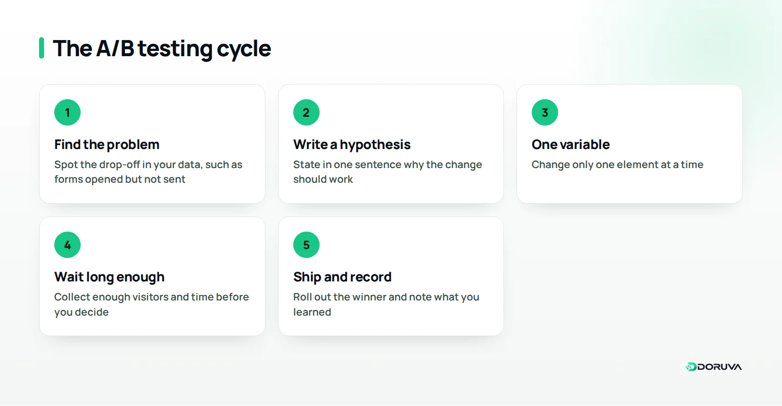
A/B testing means showing two versions of a page to different visitors over the same period and measuring which one performs better. To run a useful test:
- Start from a problem in the data, for example many visitors open the form but few submit it.
- Write a hypothesis: “Making the phone field optional will increase submissions.”
- Test one variable at a time; don't change the headline, image and form all at once.
- Collect enough visitors and time before deciding; don't call it on a few days of noise.
- Ship the winner, record what you learned, and move to the next hypothesis.
If your traffic is too low for formal tests, you can still improve. Session recordings and heatmaps show where visitors get stuck, and the questions your sales team hears reveal which objections the page still fails to answer.
Common mistakes
- Sending every campaign to the home page and expecting visitors to find the offer themselves
- Running two or three competing calls to action on the same page
- Using the brand slogan as the headline instead of stating the offer
- Testing the form on desktop only and never submitting it on a phone
- Leaving the thank-you page empty, when it is the ideal place to explain next steps and set expectations
- Forgetting the page after the campaign ends and leaving an expired offer online
Summary and next steps
A high-converting landing page is the result of deliberate decisions, not luck: one goal, a message that matches the campaign, clear value and a CTA above the fold, benefit-led copy, genuine proof, answered objections, a short and transparent form, a fast mobile experience and tracking from day one. Score your current page against these 12 points; fixing the weakest three usually brings the quickest wins.
If you need campaign landing pages that are planned properly, load fast and can be measured, Doruva's web design service handles strategy, design and development in one flow. To talk about your project, send us your web design enquiry.
Frequently Asked Questions
Should a landing page have a navigation menu?
Most campaign pages don't need a full menu, because every link can pull visitors away from the main action. A logo, a short trust section and contact details are usually enough.
Should a landing page be long or short?
The complexity of the offer decides. A free guide download can work on a short page, while a high-value service usually needs a longer page that answers the visitor's questions.
Do I need a separate page for every ad campaign?
A separate page, or at least a separate headline, for each core message or audience is a good rule. It keeps the promise in the ad and the message on the page aligned.
How many fields should a landing page form have?
There is no magic number; the test is whether you will use the information at first contact. Every unnecessary field lowers the willingness to submit, so extra questions often work better on the first call.
How can I improve a landing page with low traffic?
Use session recordings and heatmaps to see where people get stuck, and feed the questions your sales team hears back into the page. Making one change at a time and watching the results also gives useful signals.